Ningjutong / Micun
Led the design and visual refinement of the Ningjutong official website, creating a clear, trustworthy, and community-oriented digital presence that reflects the company’s role as a local market investment and operations service provider.
Yinchuan Ningjutong Business Management Co., Ltd.
Website & Brand Visual System Design
Graphic Design / UI Design
Led the design and visual refinement of the Ningjutong official website, creating a clear, trustworthy, and community-oriented digital presence that reflects the company’s role as a local market investment and operations service provider.
My Role
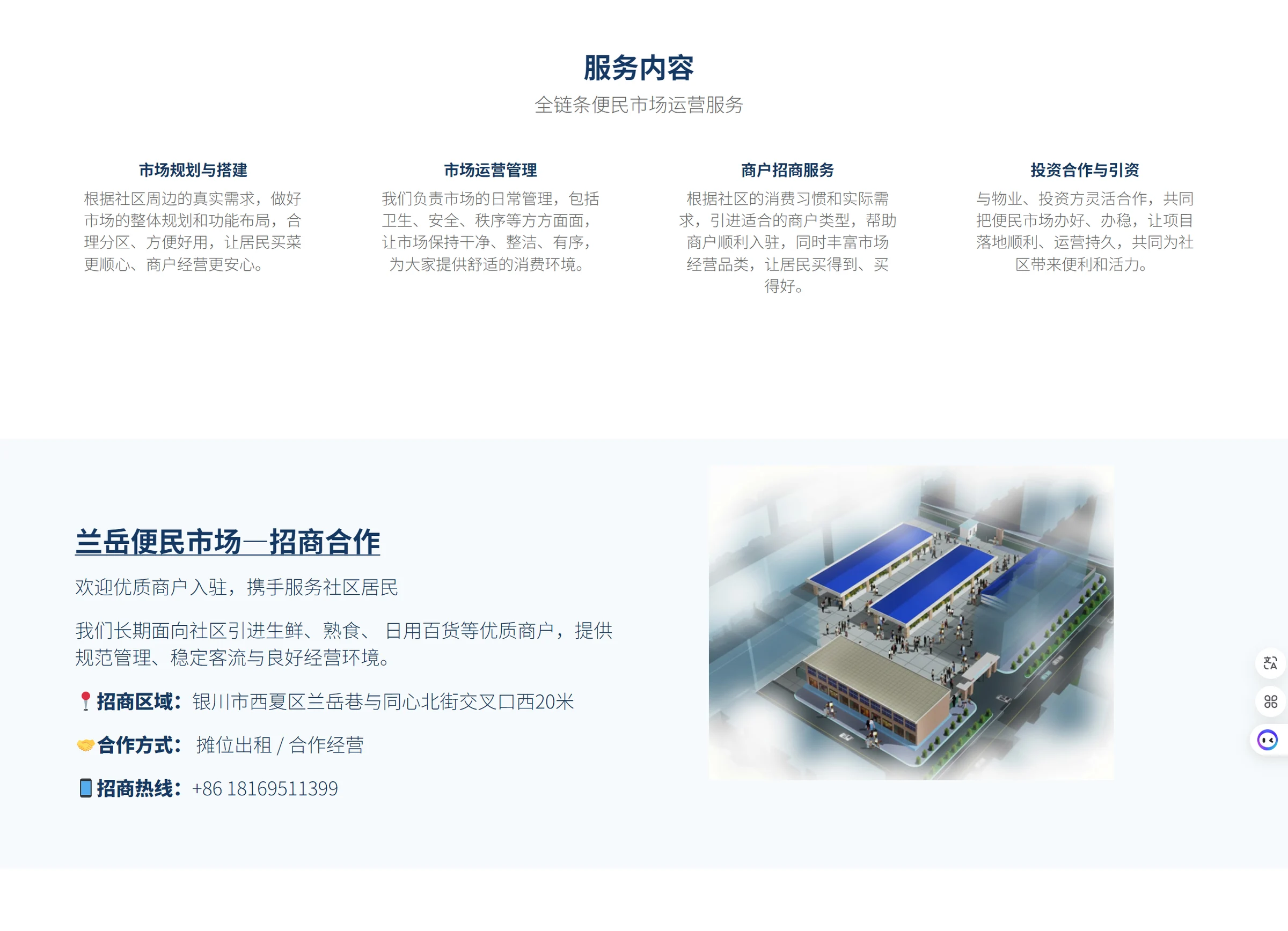
Defined the overall visual direction of the website, balancing institutional credibility with an approachable, community-oriented tone
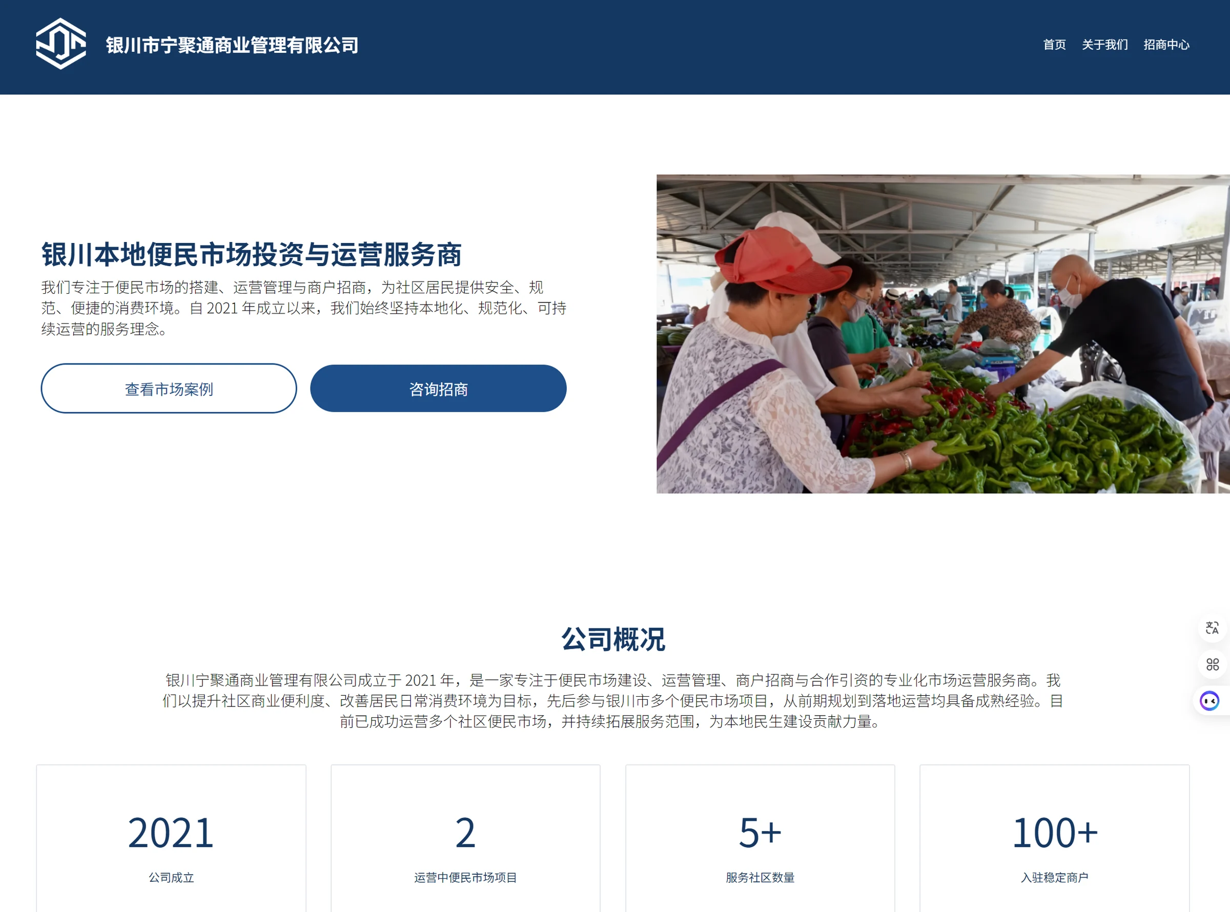
Designed the homepage layout and information hierarchy to clearly communicate business scope, investment opportunities, and company positioning
Established a cohesive UI system, including typography, a deep blue and neutral gray color palette, and button styles to enhance usability and trust
Curated and selected imagery that reflects authentic local market environments, reinforcing the brand’s focus on community service and operational capability
Structured key content sections such as company overview, service offerings, and data highlights (2021 / 2 / 5+ / 100+) to improve clarity and information flow
Collaborated with stakeholders to align messaging with investment goals and local government and community priorities
Designed a corporate website for a local market operations company in Yinchuan, focused on improving clarity, credibility
Design Goals
Build trust through a clean, institutional visual language
Clearly communicate business scope
Improve information hierarchy for faster user understanding
Visual Strategy
Color System Deep blue to convey credibility and authority, paired with neutral gray for balance and readability
Typography Clean, structured type hierarchy to reflect professionalism and improve scanning
Imagery Direction Real-life market scenes to ground the brand in authentic community context
Layout Thinking
Left-right hero layout to balance information and human context
Strong CTA buttons to guide招商行为
Modular sections to support scalability for future content