乐邻 JoyNeighbour
Connecting elderly Chinese immigrants with their local communities through nearby social activities.

Overview
乐邻 JoyNeighbour
Connecting elderly Chinese immigrants with their local communities through nearby social activities.
通过邻里活动,帮助华人长者融入本地社区、重拾社交的快乐。

Overview
JoyNeighbour is a community-driven app that helps elderly Chinese immigrants discover nearby events and reconnect with others through familiar, intuitive, and inclusive experiences. 乐邻 JoyNeighbour 是一款专为在美华人长者打造的社交活动App,旨在通过熟人陪伴、附近活动推荐、导航与语音等功能,鼓励长者走出家门,融入邻里社区。
Project Details
Type : Mobile App Design
Role : Lead UI/UX Designer
Scope
Research, Data Analysis, Data Visualization, Information Architecture, User Flow, Visual Design, Prototype, Wireframes
The Problem
Many elderly Chinese immigrants experience social isolation due to language barriers, digital illiteracy, and lack of culturally relevant social spaces. 许多年长华人移民在美国面临孤独、语言障碍和文化割裂,难以主动参与社区生活。
Key Challenges
Digital Gap : Many seniors are unfamiliar with modern mobile apps and interfaces, making it difficult for them to access digital social platforms.
长者缺乏数字工具操作经验,难以使用主流社交平台
Social Isolation : Physical distance from family and cultural communities leads to loneliness and disconnection.
受语言与文化差异影响,长者往往缺乏同龄交流机会,容易陷入孤独情绪。
Navigation Anxiety: Fear of getting lost or not understanding the local environment discourages seniors from attending events.
害怕走丢、不熟悉周边环境,限制外出意愿
Lack of Motivation: Without platforms tailored to their needs, seniors feel less motivated to organize or join group activities.
失去动力组织活动或参与集体娱乐
Elder-Friendly Design System
To address the unique needs of elderly Chinese immigrants, we developed a comprehensive design system focused on accessibility, cultural relevance, and ease of use.
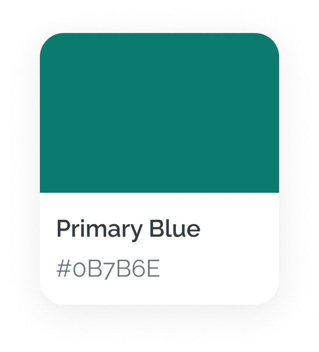
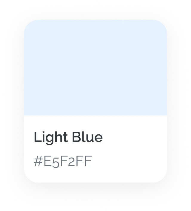
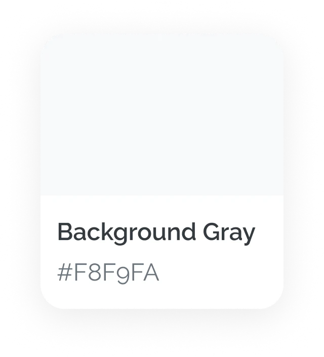
Color Palette
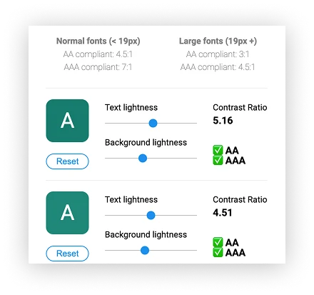
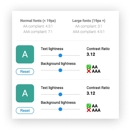
High-contrast colors were used to enhance visibility, especially for users with low vision or age-related vision decline.
Typography
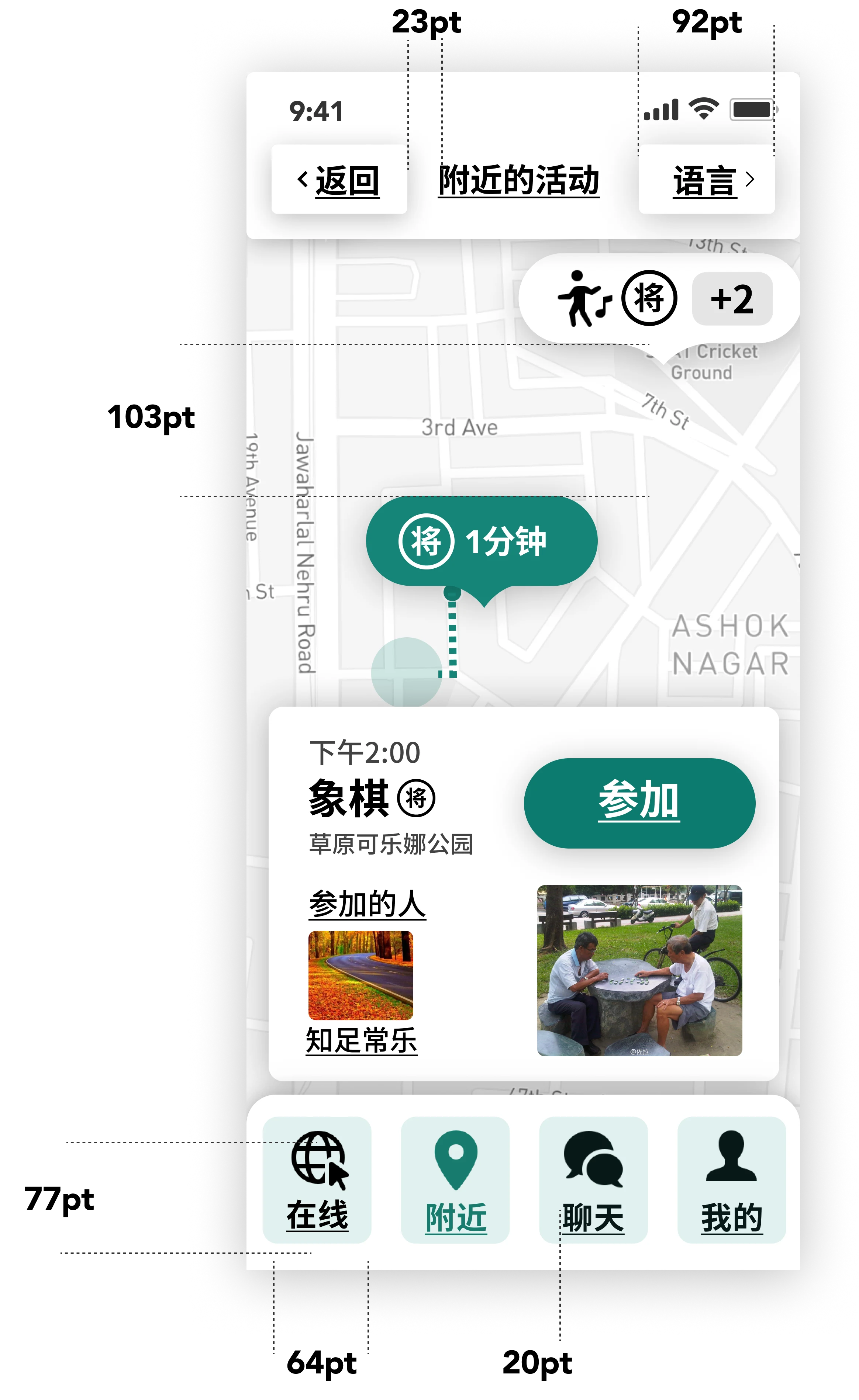
Text elements were designed with a minimum of 24pt font size to accommodate users with presbyopia and ensure readability without strain.
Source Han Sans CN VF
Raleway
Accessibility-First Design System
Safe spacing, Color contrast — 4.51:1 ,Font size check