Brand guidelines
& visual direction.
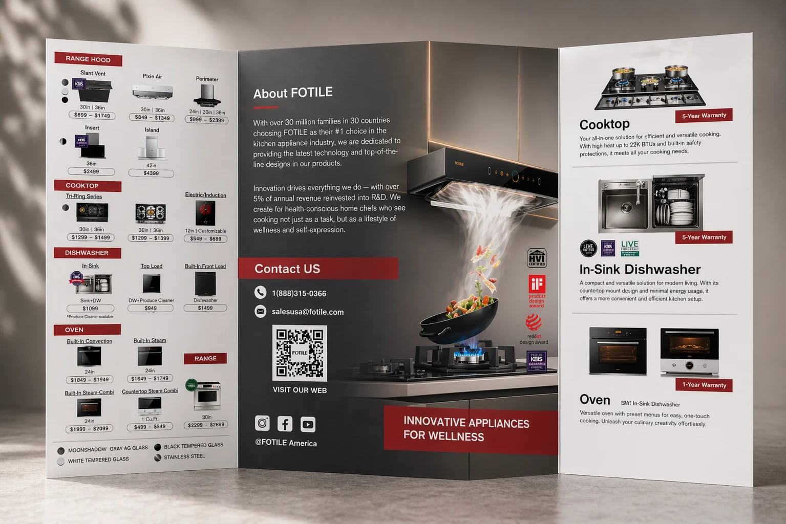
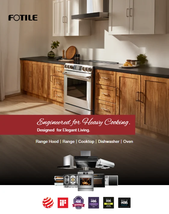
I created and maintain FOTILE America’s brand guidelines and review all visual creative across its marketing channels. My role combines brand systems, creative review and hands-on design across campaigns, paid ads, email and website content.
Consistent expression.GUIDELINES / CAMPAIGNS / DIGITAL
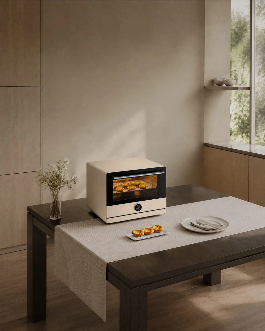
Brand guidelines / Visual direction / Campaigns / Digital
Brand standards & visual oversight.
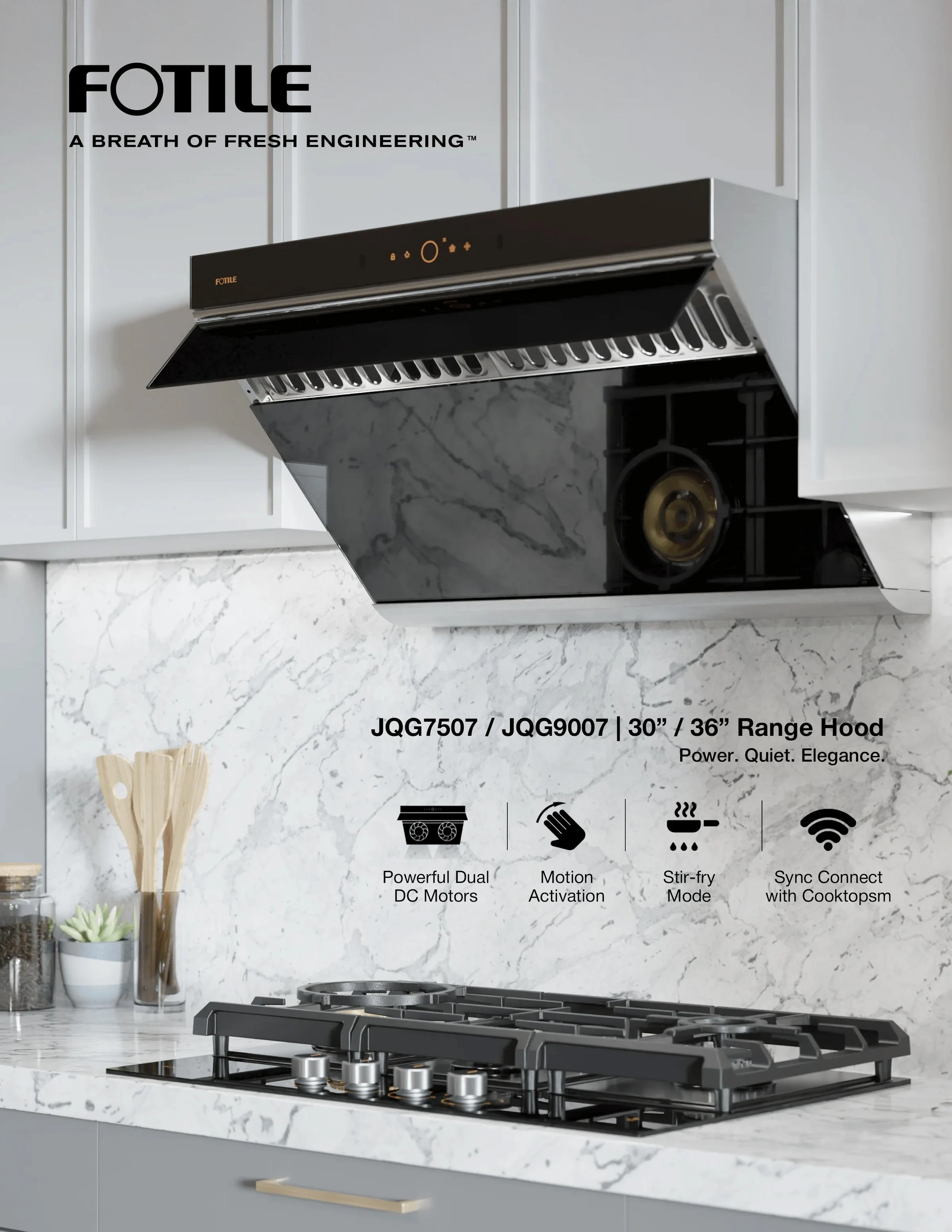
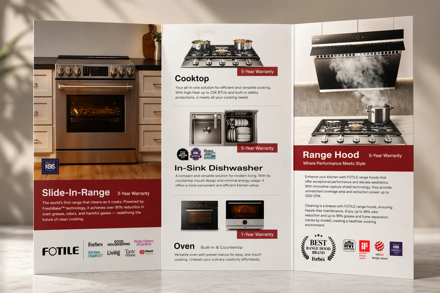
I am responsible for reviewing all visual materials for FOTILE America and for developing and maintaining the brand guidelines that shape their execution. I provide visual feedback on layouts, typography, color, imagery, product presentation and motion, working with internal teams and agencies to align creative across channels. Alongside this oversight, I develop campaign visuals, templates and key marketing assets.
From guidelines to creative review.
I translate the brand’s visual identity into practical standards, reusable templates and clear review criteria. The guidelines cover typography, color, imagery, the red brand element, layout hierarchy and motion applications. I use this system to review creative, explain revisions and guide consistent execution while allowing for the needs of each campaign and platform.
Brand guidelines & visual system
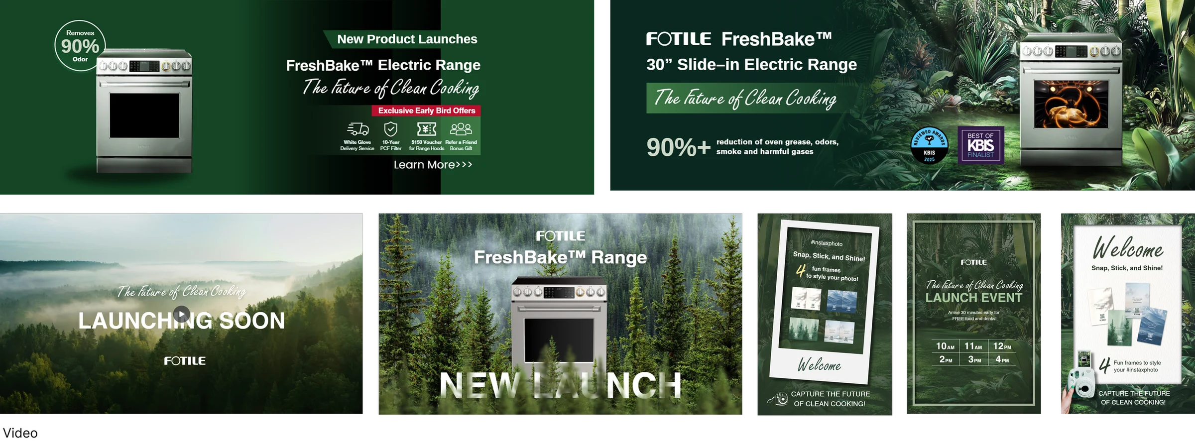
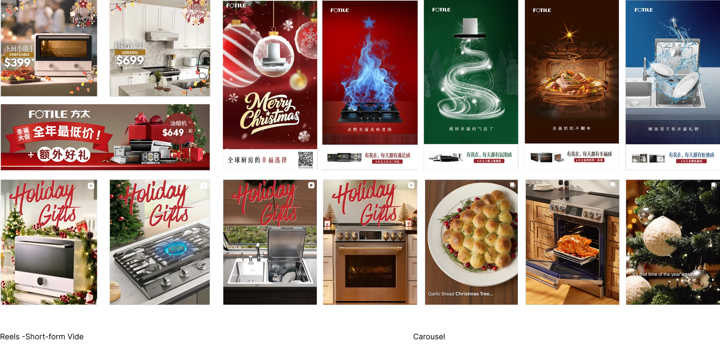
I created and maintain brand guidelines for FOTILE America, turning the visual identity into practical rules for typography, color, imagery, the red brand element, layout hierarchy and recurring brand moments. The ongoing Creative Guideline 2.0 extends these standards across social, video, platform-specific thumbnails, email and new product key visuals, with reusable templates and examples for team and agency handoffs.
One consistent system. Flexible expression.
Brand foundation
Approved logo usage · Brand colors · HQ typography standards · Product naming and claims accuracy
Visual system
Feed direction · Image treatment · Message hierarchy · Layout templates · Cover and motion rules
Content formats
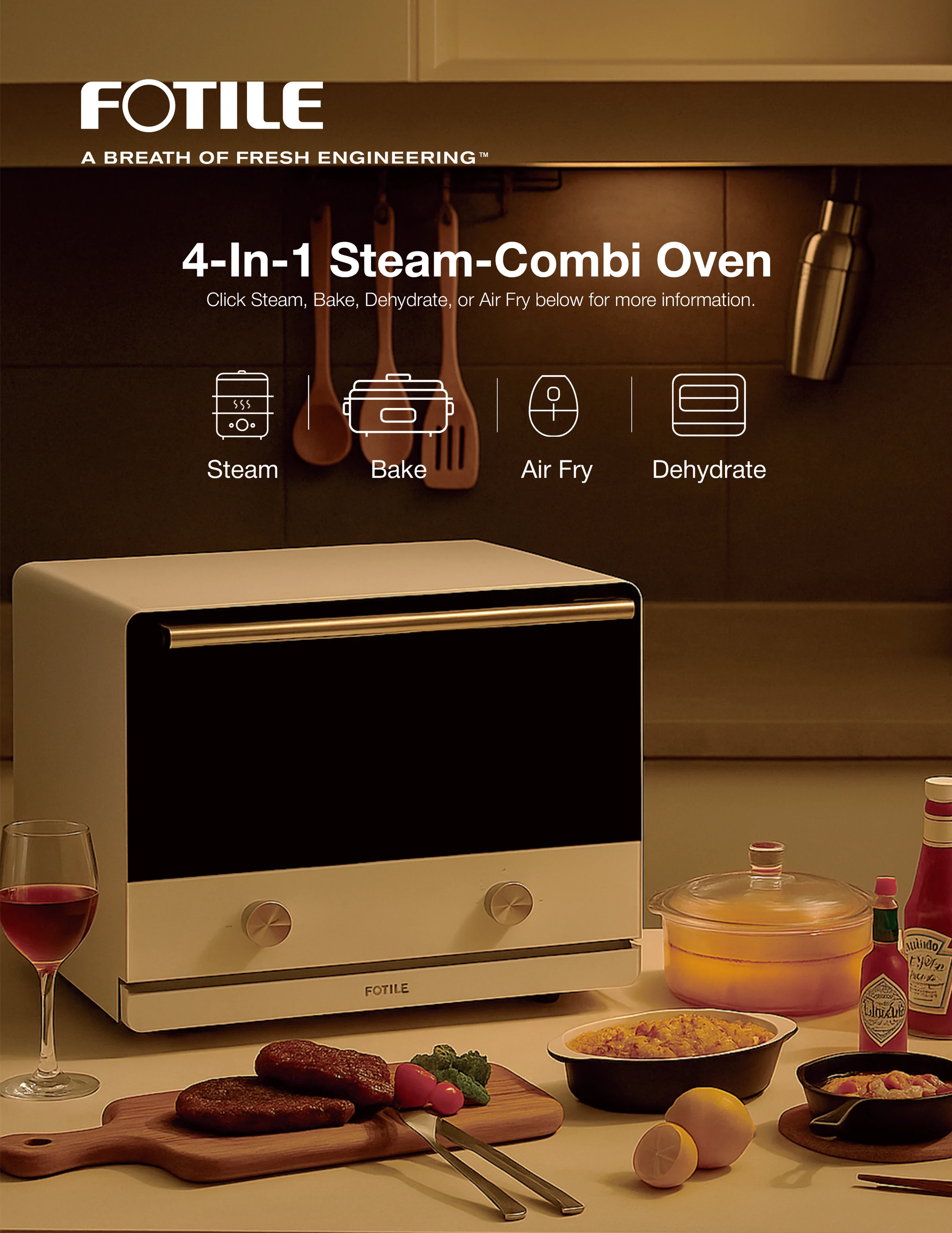
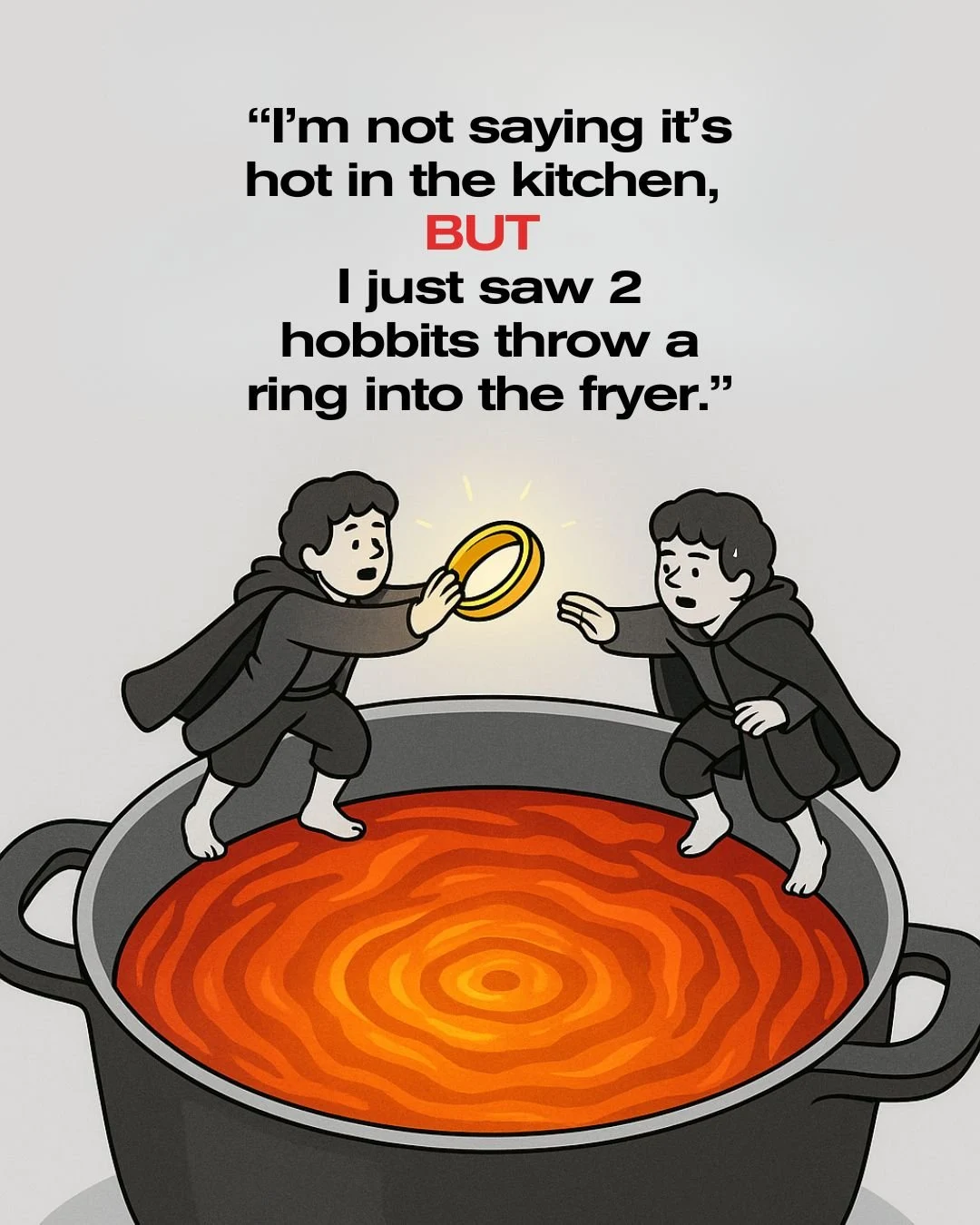
Product-led carousels · Brand stories · Lifestyle · Reels · Paid video · Campaigns
Core colors & supporting tones
Neutral tones lead. FOTILE red provides a controlled accent.
Black
#000000White
#FFFFFFGray
#595757FOTILE red
#9D1D22Soft greige
#C8C0B5Warm gray
#8B867EWood
#866347Steel
#B6B7B5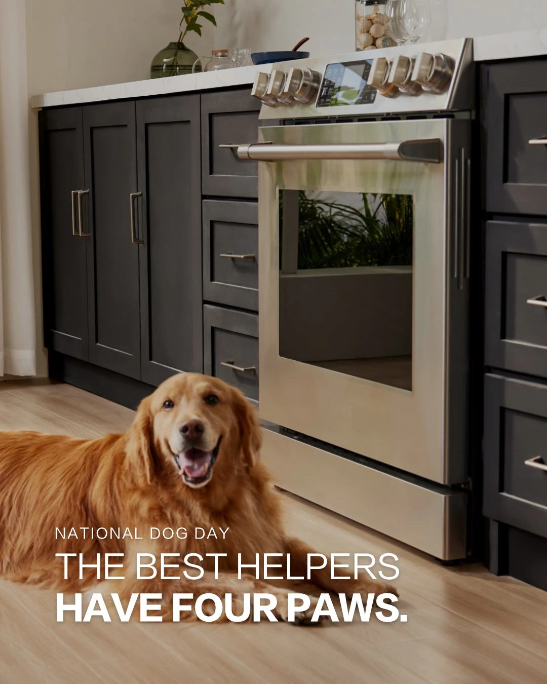
A clear hierarchy, across formats.
FZLanTingHeiS-R-GB for the main text, with FZLanTingHeiS-H-GB for highlighted words.
- 4:5 carousel
- 1080 × 1350 px · 108 px safe margin
- Content slides
- One feature, benefit or use case per slide.
- Brand close
- FOTILE logo on a separate final slide.
One story. A consistent rhythm.
Hook
A relatable question or everyday problem.
Build
One focused product feature or benefit.
Resolve
A clear takeaway or everyday outcome.
Brand close
A consistent FOTILE or campaign end frame.
Visual direction & system refinement
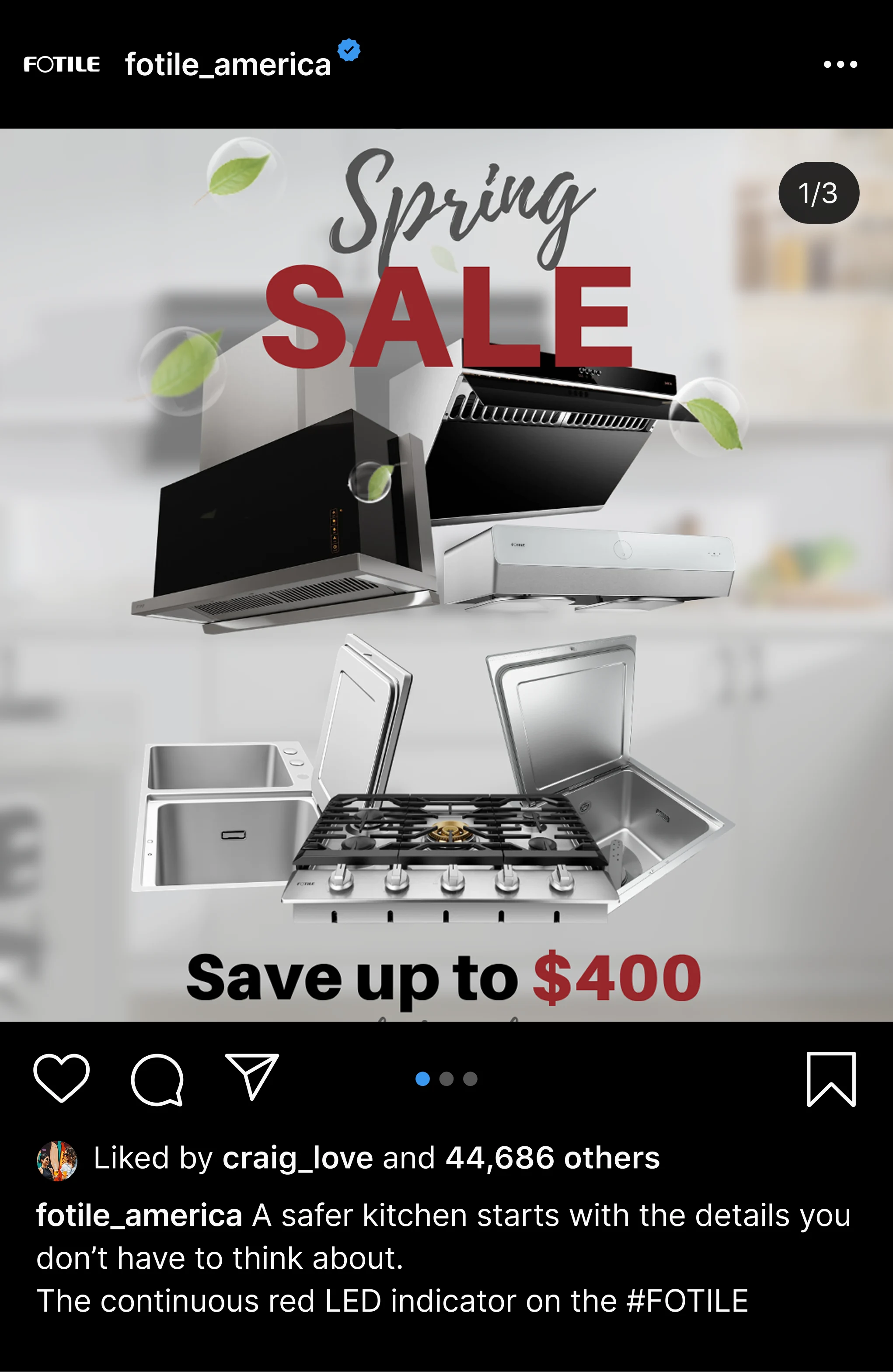
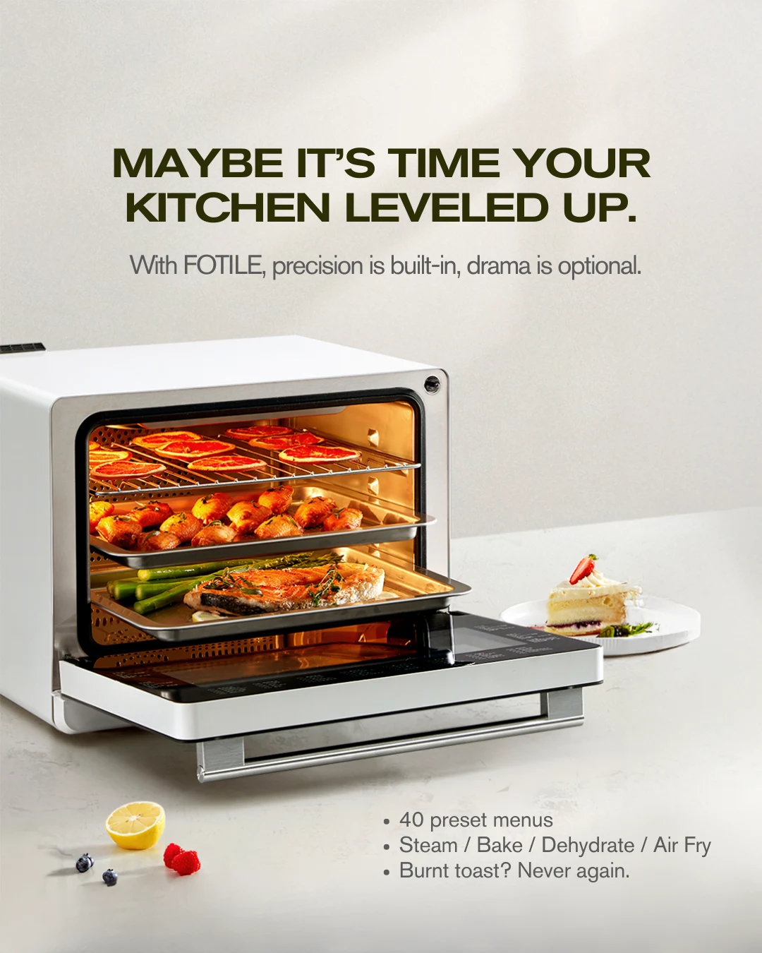
I review all visual creative for FOTILE America, including work produced by internal teams and external agencies. The feed comparison shows the shift toward consistent image tones, clearer typography and a unified highlight icon system. Image references define how product finishes and material details should appear across creative.
Before / After
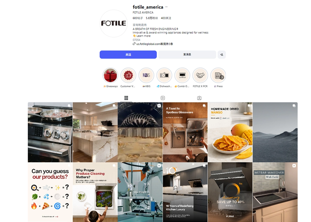
Previous feed
Mixed image treatments, message hierarchies and highlight styles.
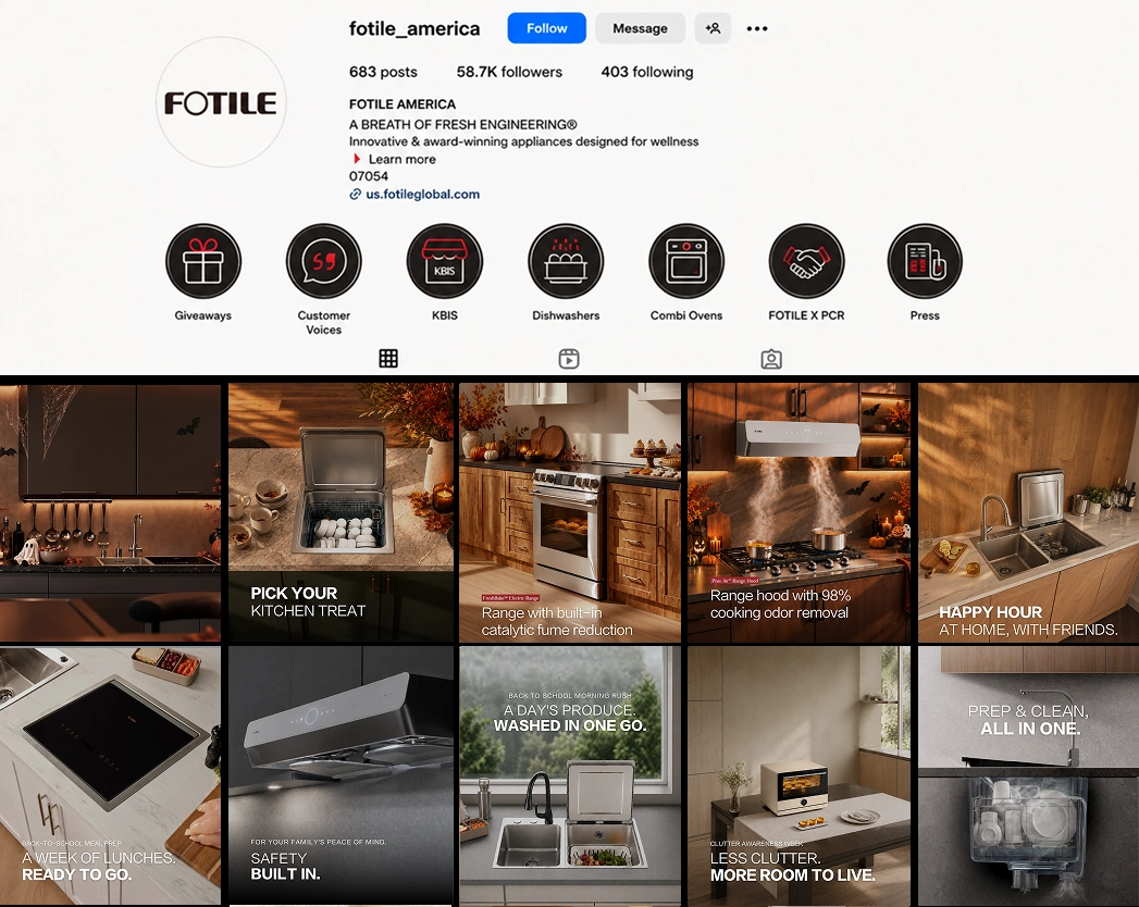
Updated visual direction
Consistent image tones, clearer typography and a unified highlight icon system.
Balanced. Natural. Consistent.
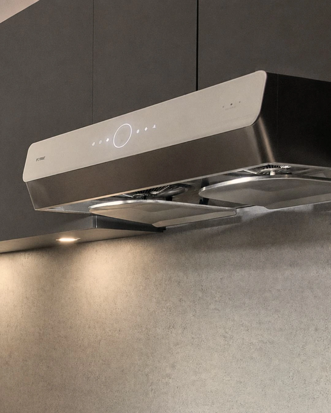
Too warm
Color casts distort stainless steel and product finishes.
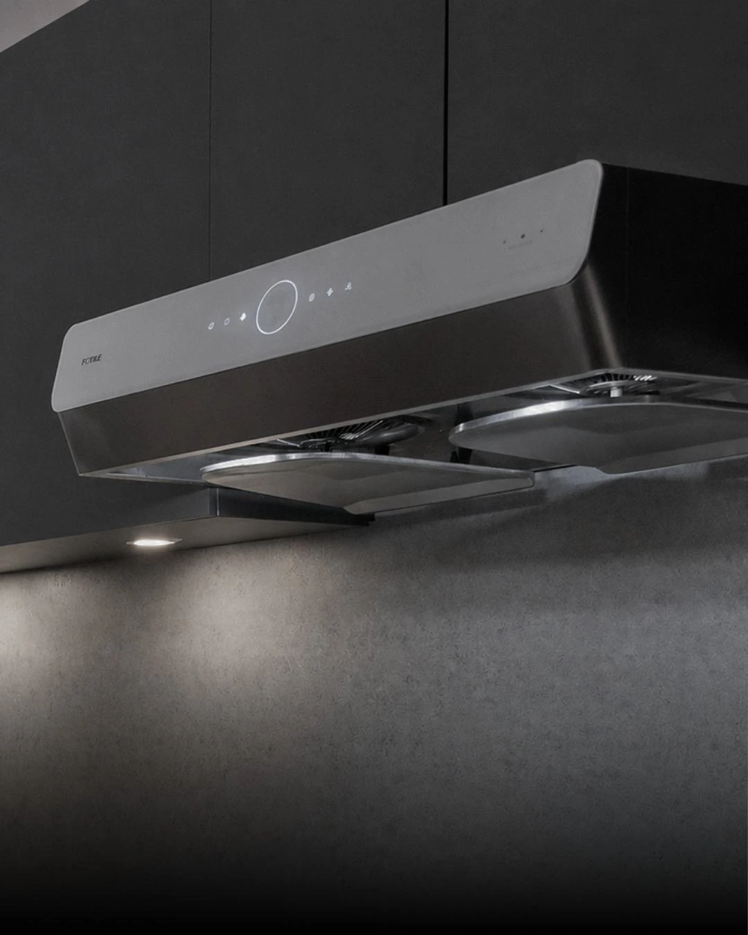
Balanced
Neutral product finishes, with natural warmth in the environment.
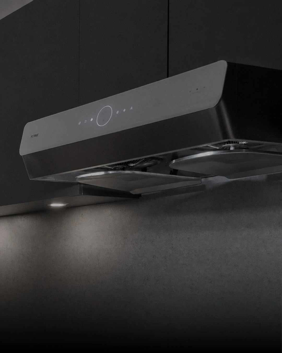
Too dark
Heavy shadows hide material and product details.
Halloween campaign
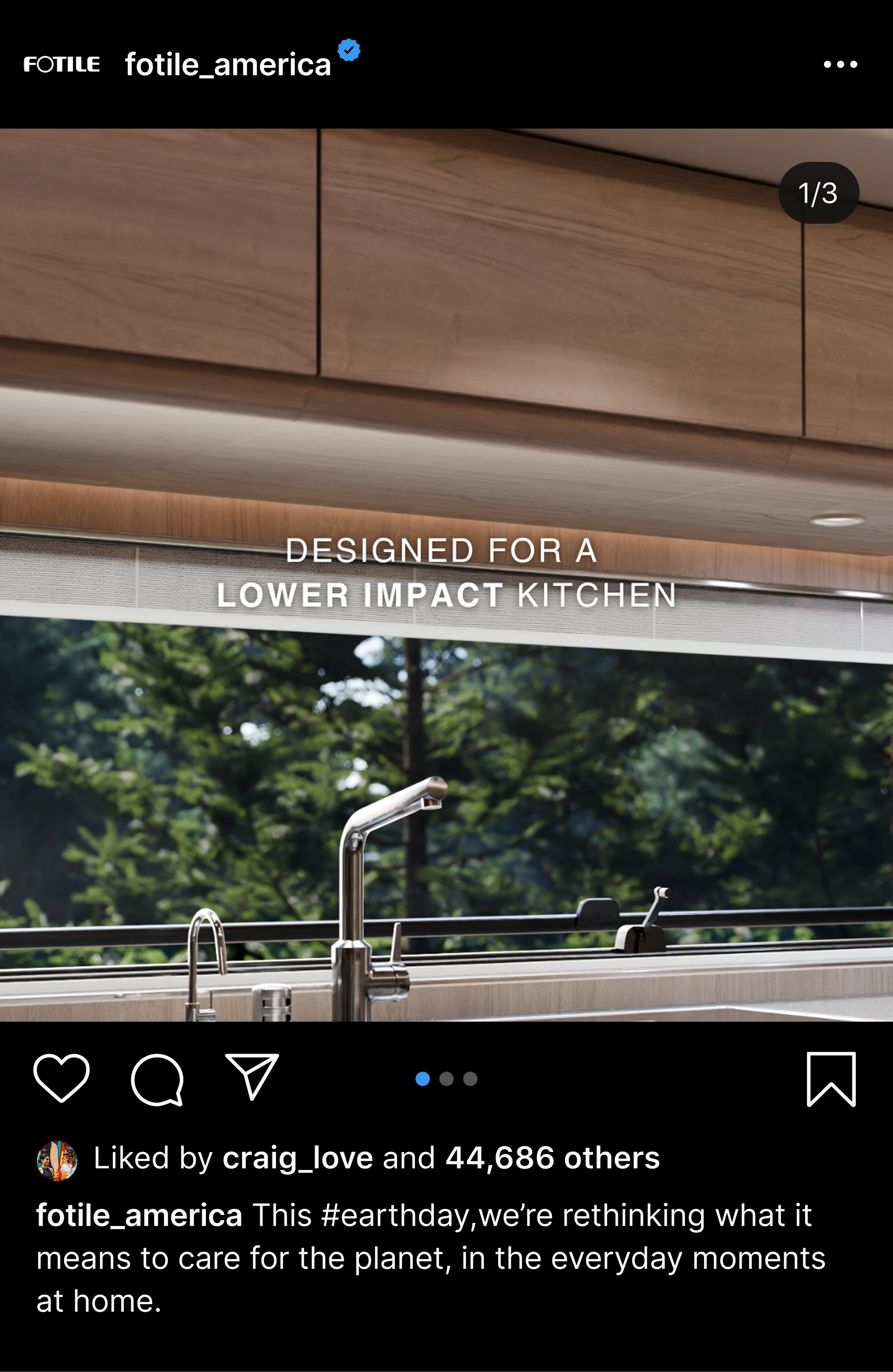
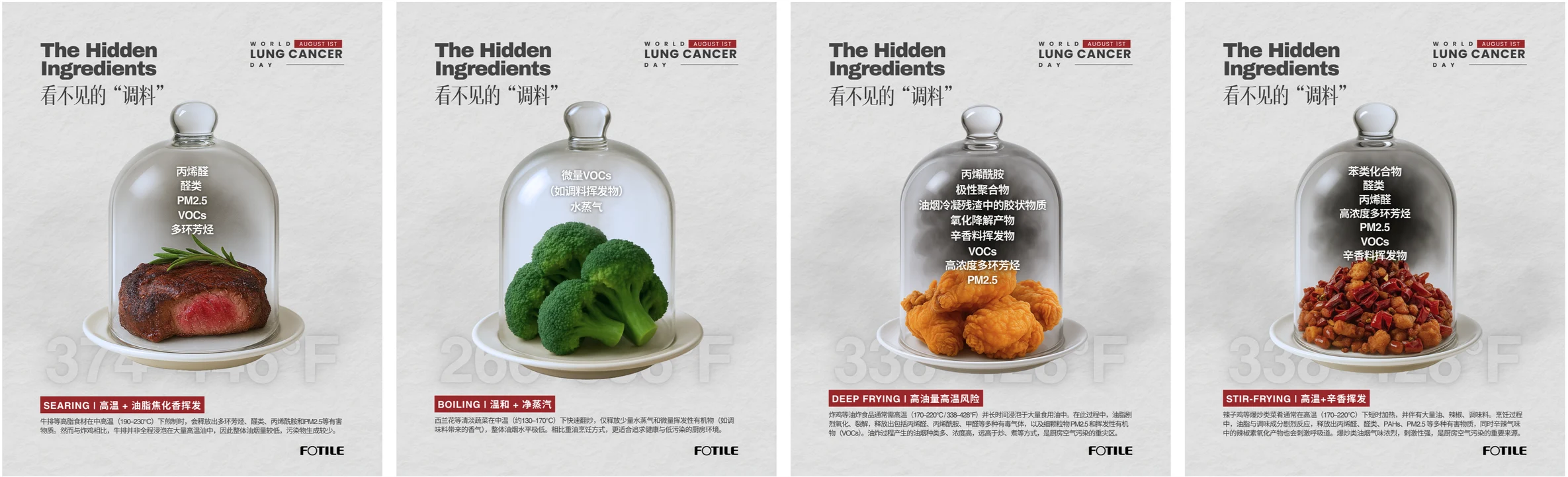
A Halloween campaign bringing range hoods, cooking appliances and dish care into one seasonal visual world. The series combines atmospheric kitchen scenes, clear product benefits and a playful ghost motif.
A little spirit in the kitchen.
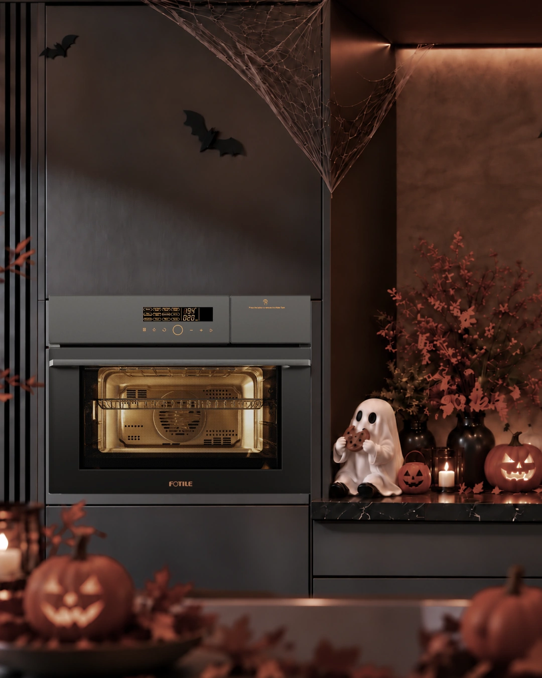
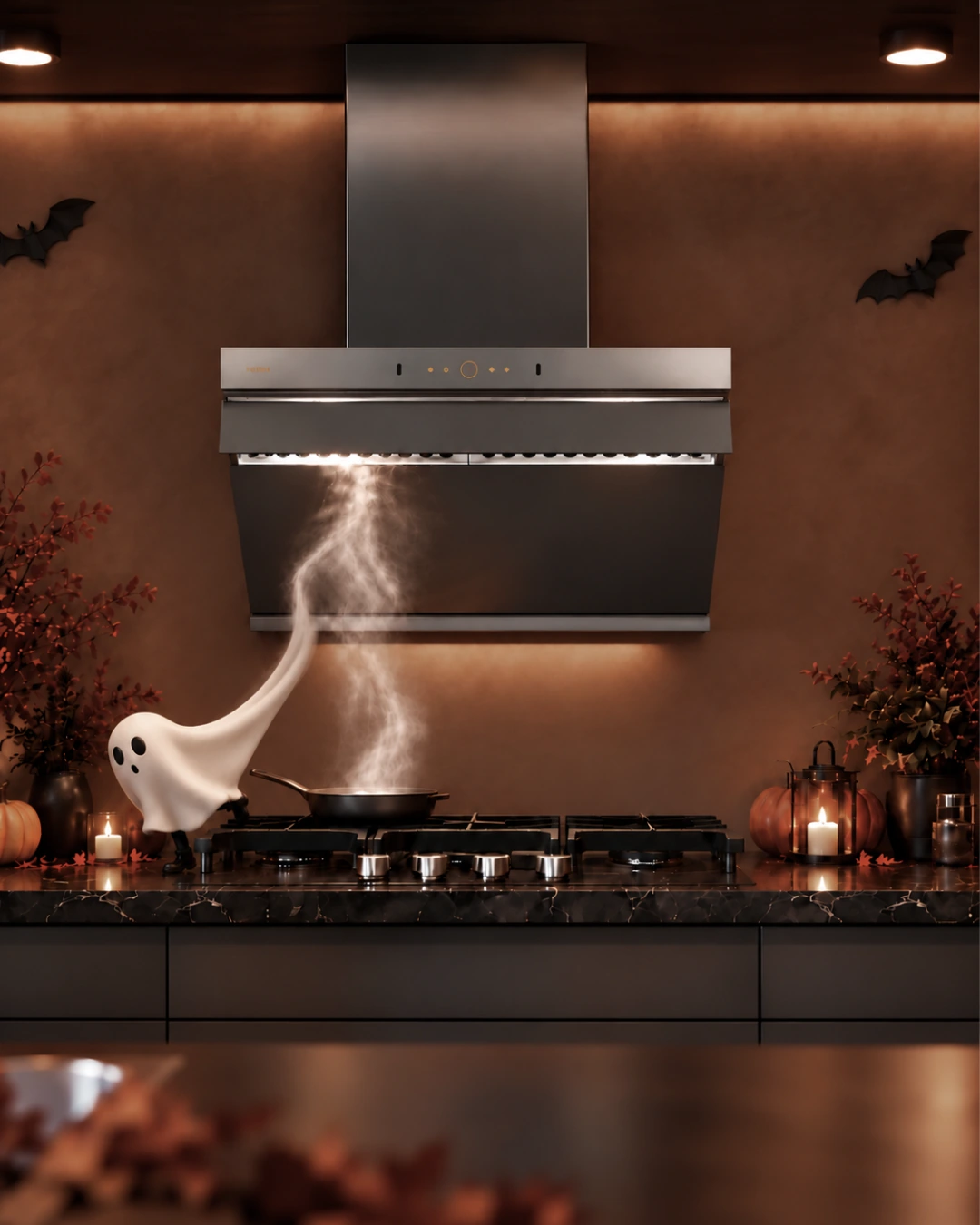
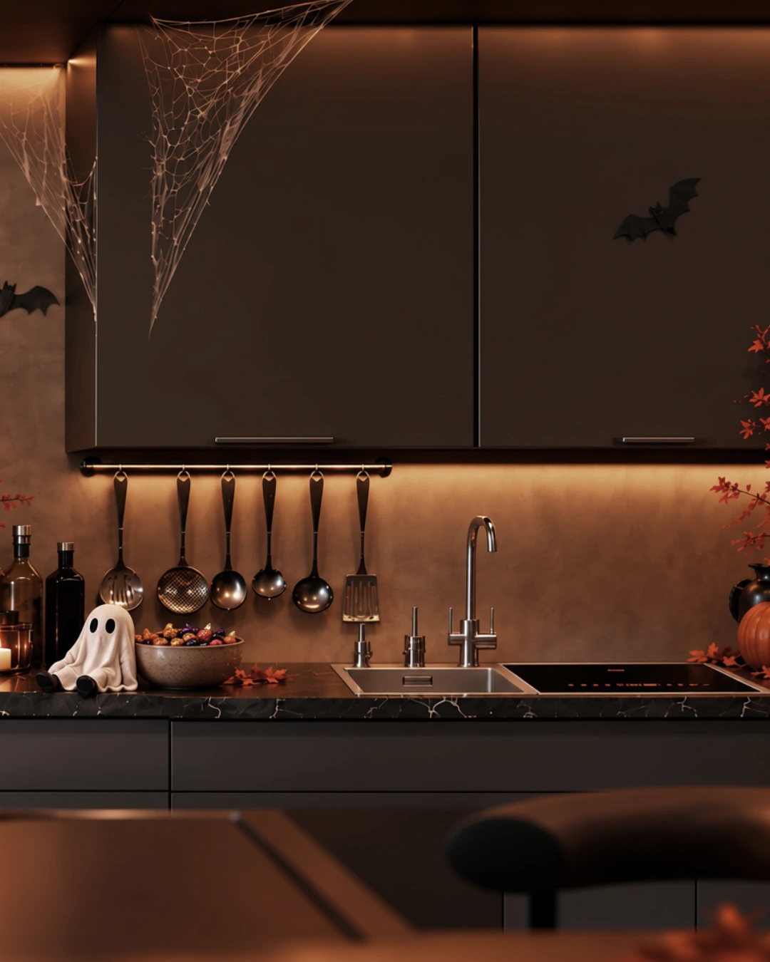
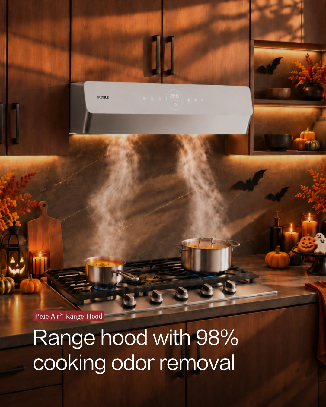
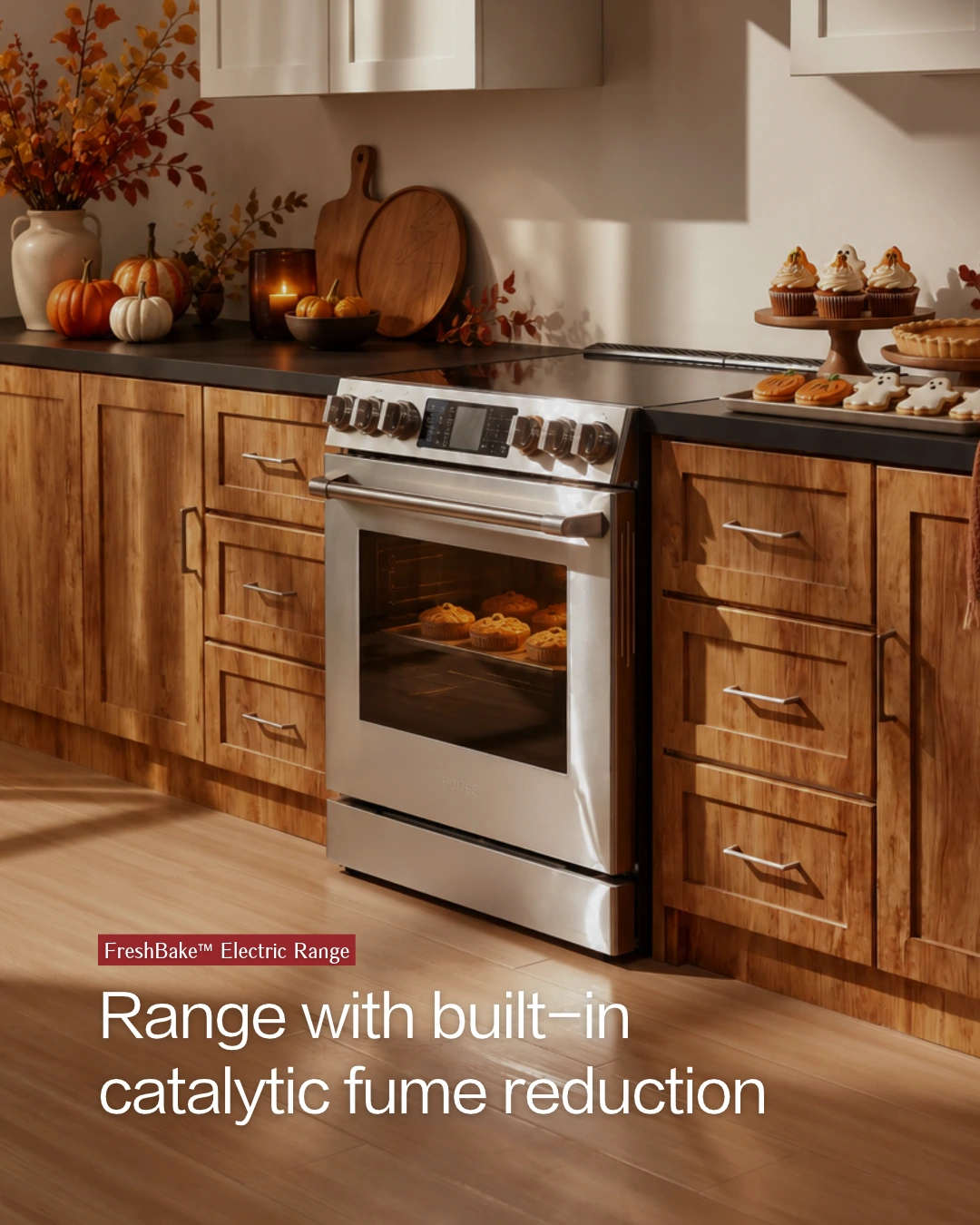
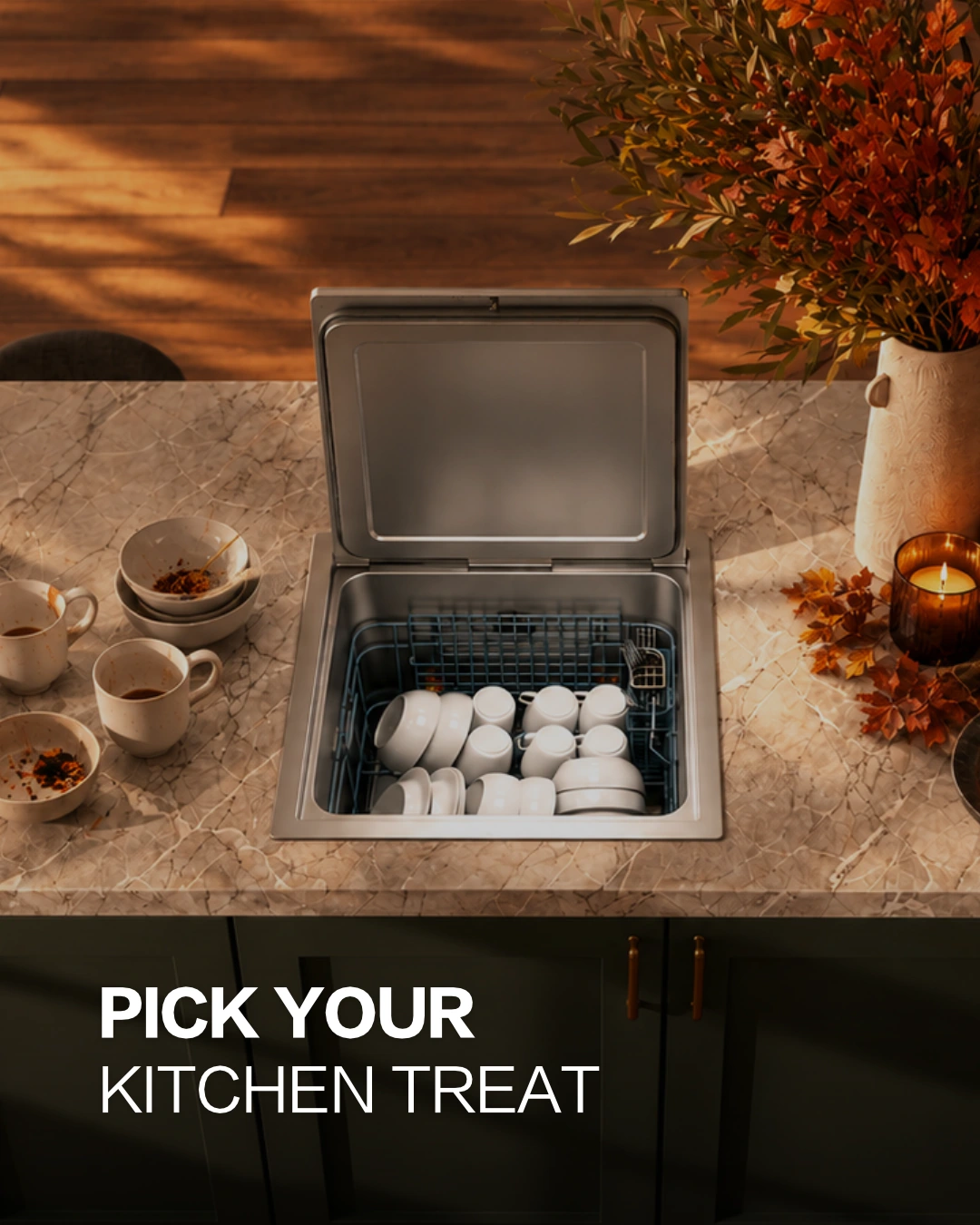
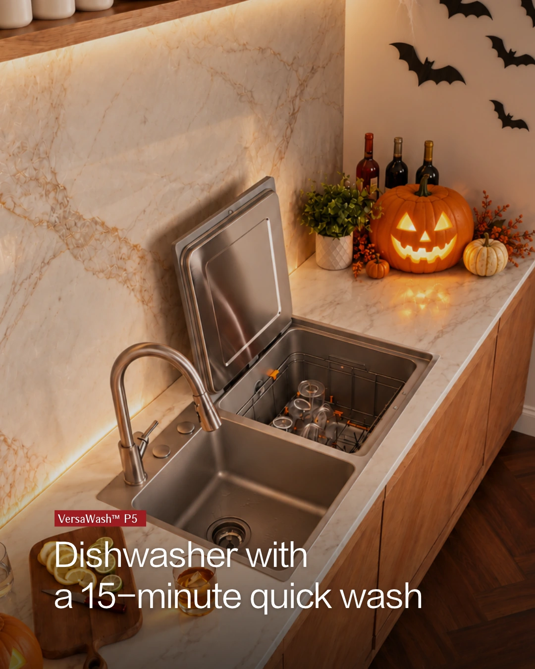
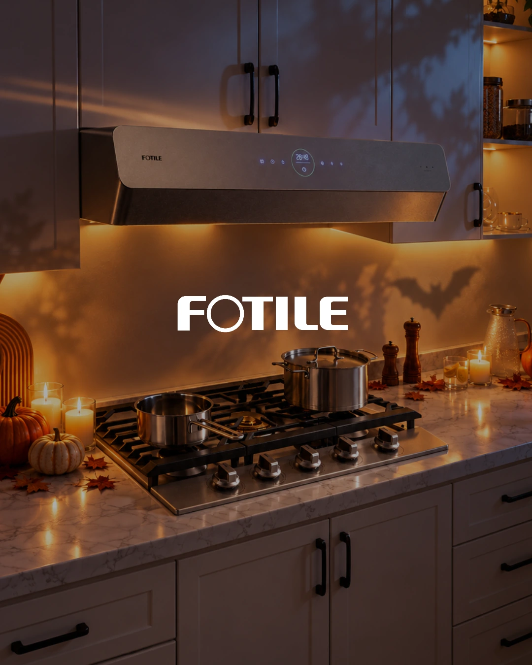
Selected campaign imagery uses AI-assisted scene development.
Paid Ads
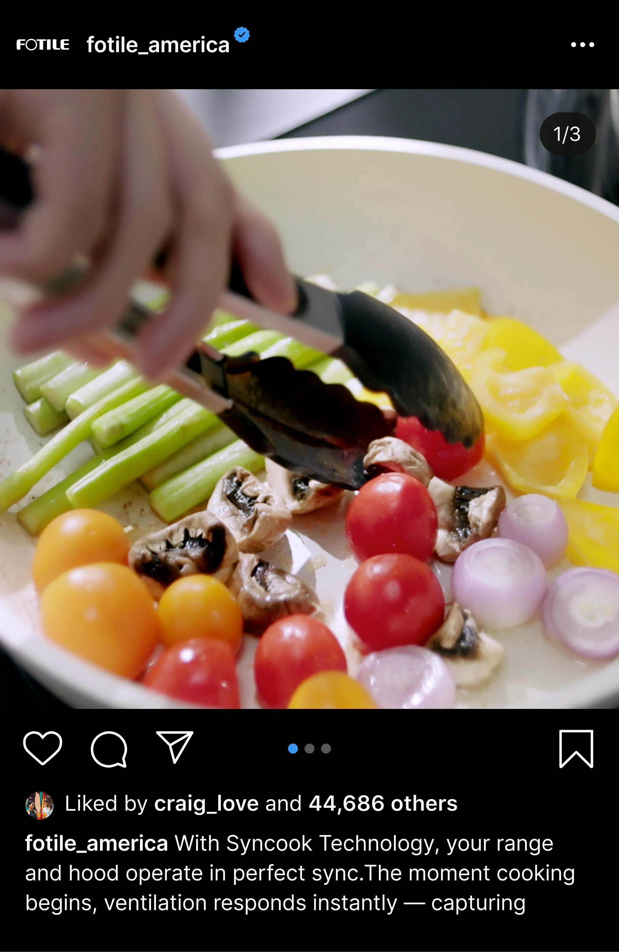
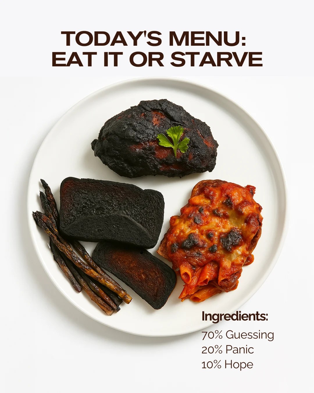
I design product-focused paid creative and edit short-form video, shaping opening hooks, product-benefit callouts, pacing and visual consistency. This Halloween ad connects an everyday kitchen concern with FreshBake’s product story.
Email template design
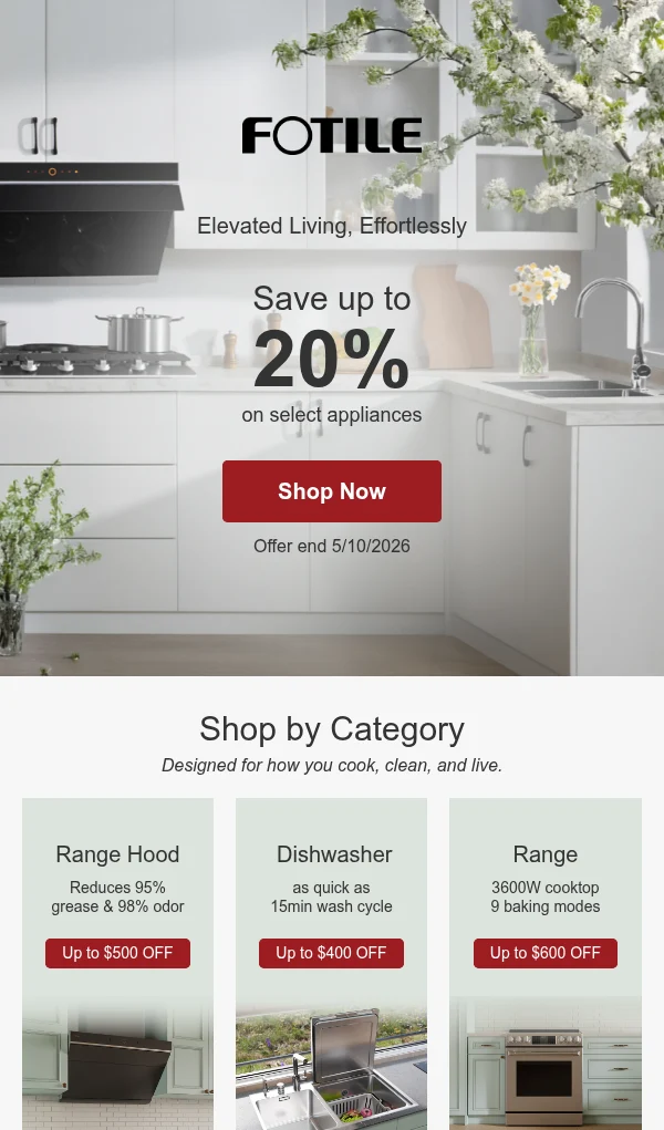
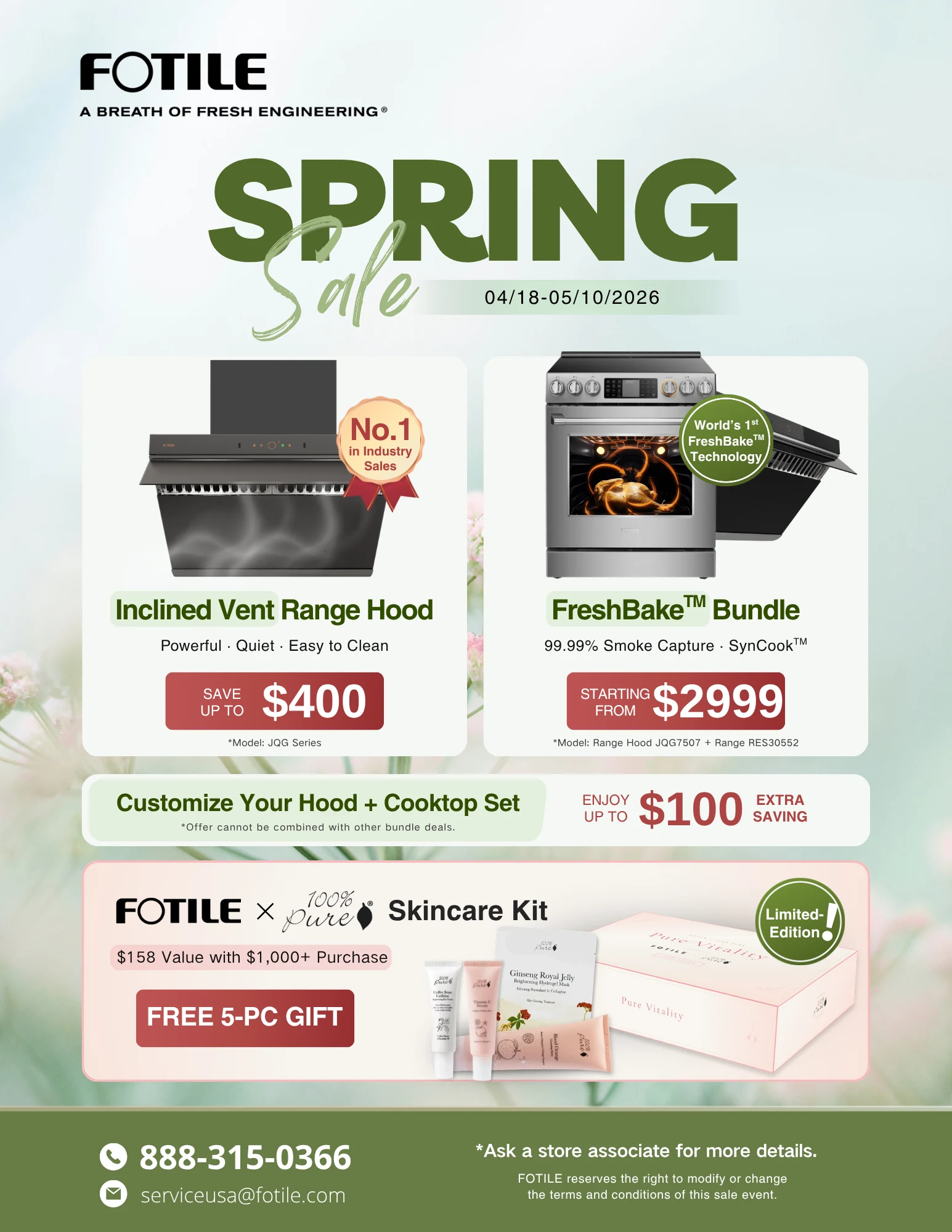
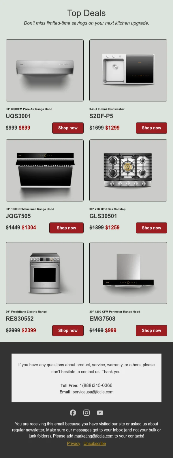
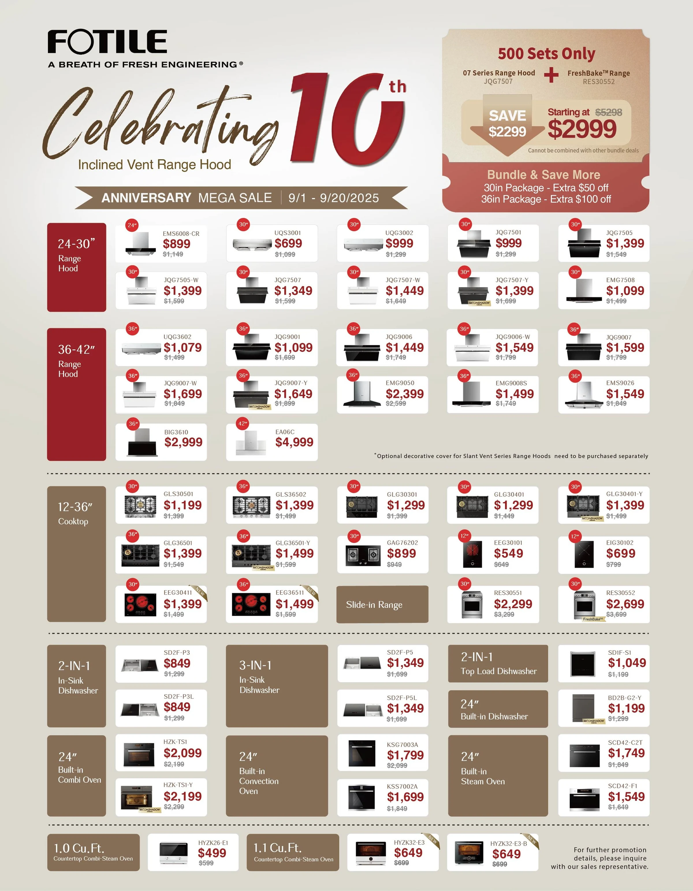
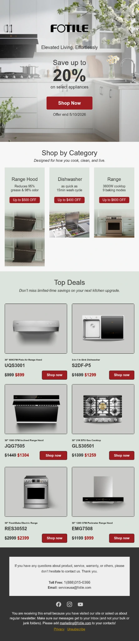
I design email templates and refine their desktop and mobile layouts in Klaviyo. The comparison pairs the previous template with the updated Costco email, showing the development of product imagery, content hierarchy, calls to action and the branded footer. Content, links and campaign settings are coordinated with the email team.
Before / After
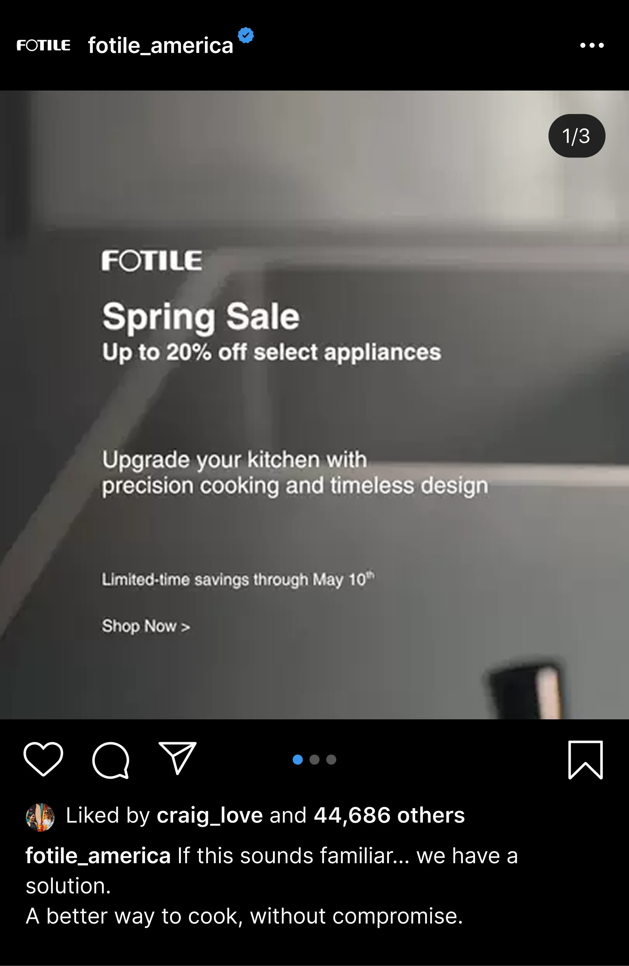
Previous email template
The existing Spring Sale layout.
Costco · updated email design
Product imagery, content hierarchy, calls to action and a unified footer.
View full email ↗Scroll within each email to explore the full layout. Content, links and campaign settings are coordinated with the email team.
Website design
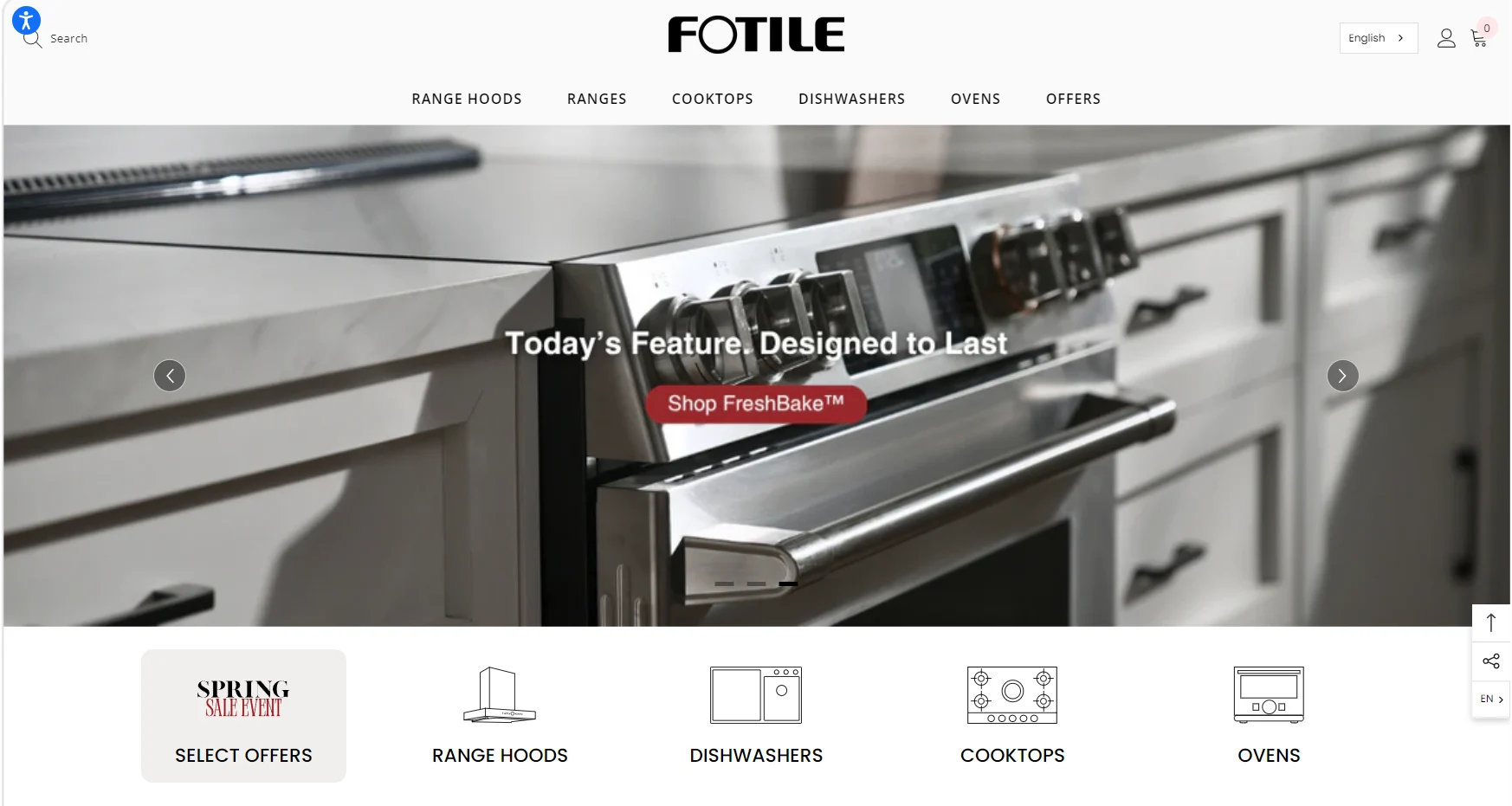
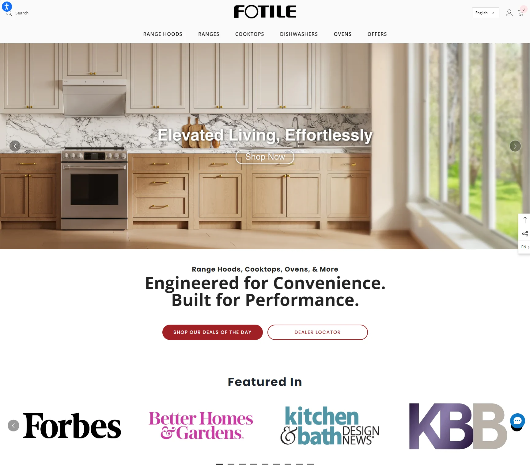
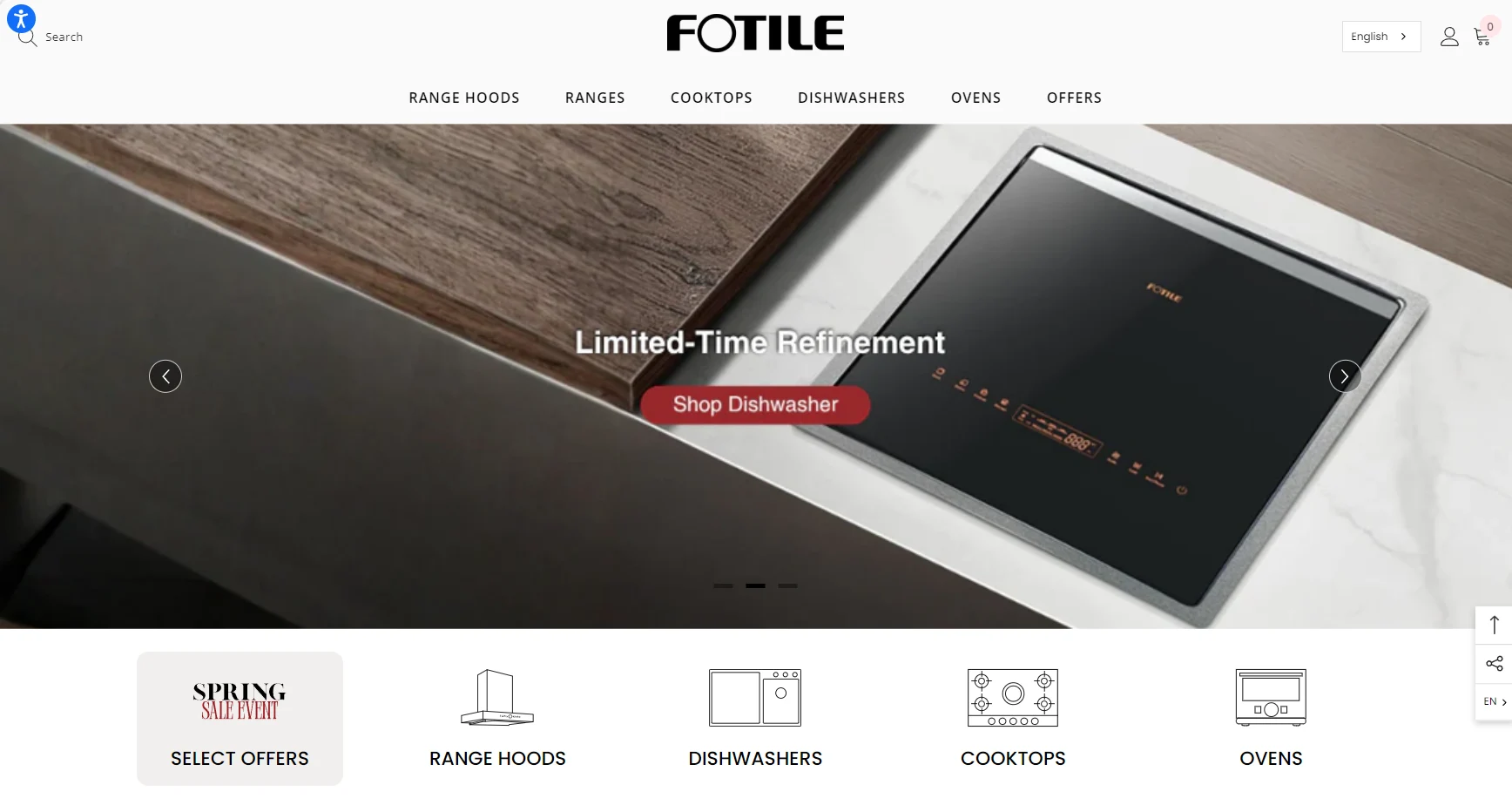
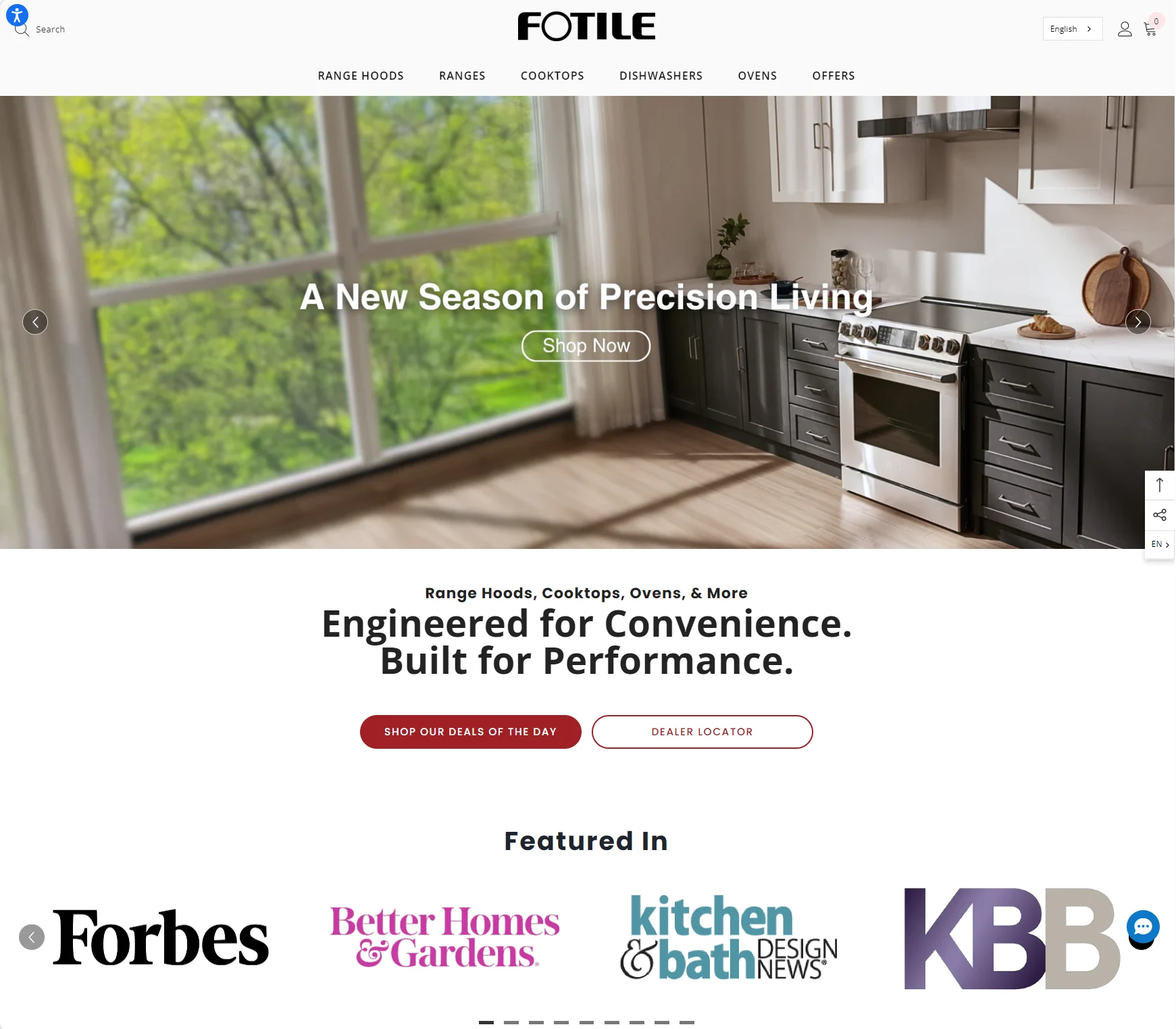
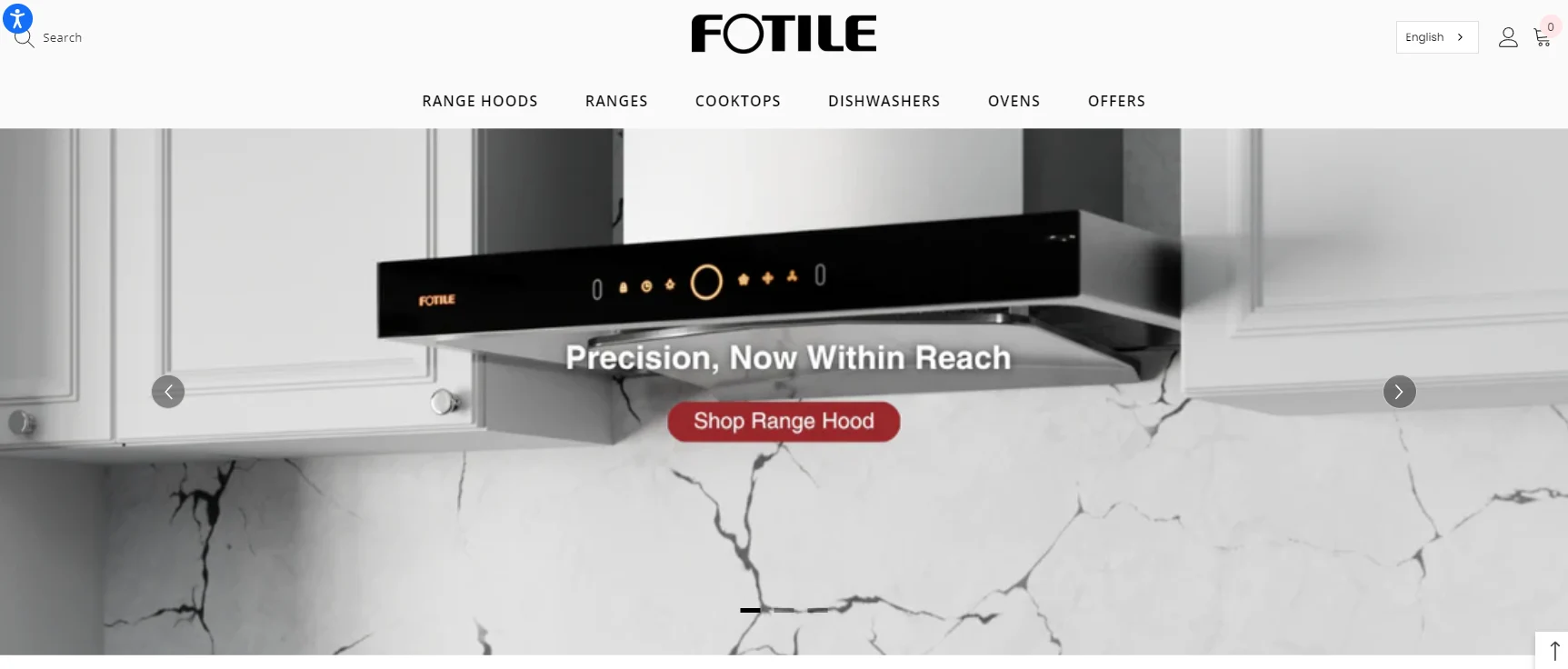
Selected website layouts and product-page visuals for FOTILE America.
Website layouts & product pages
网站素材待补充:Homepage、Landing Page 与产品页面。
What I contributed.
I created and maintain brand guidelines, review all visual creative across FOTILE America’s marketing channels, and translate feedback into concrete design revisions. My contribution spans visual standards, creative direction and review for internal teams and external partners, reusable templates, and hands-on campaign and product design. I collaborate with marketing, content, email and web partners on implementation; email copy, links and campaign settings are coordinated with the email team.
More selected FOTILE work