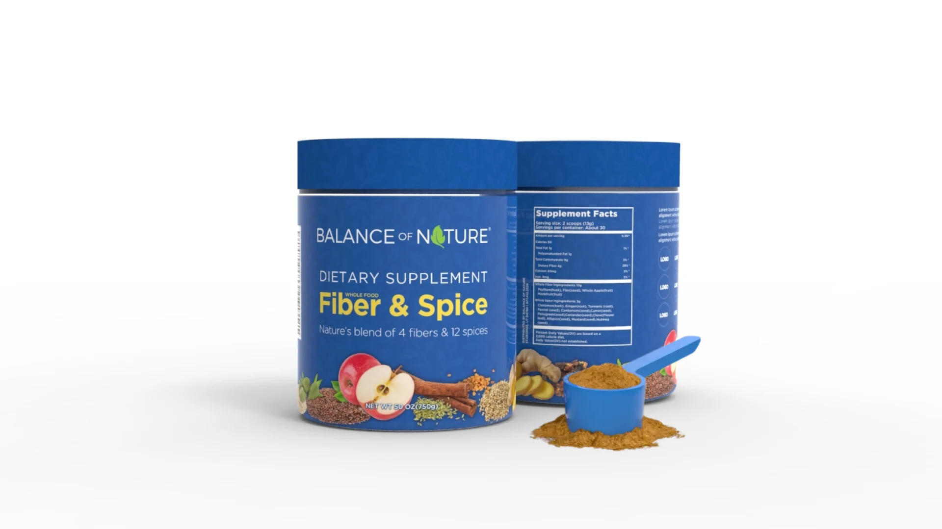
Balance of Nature.
Fiber & Spice
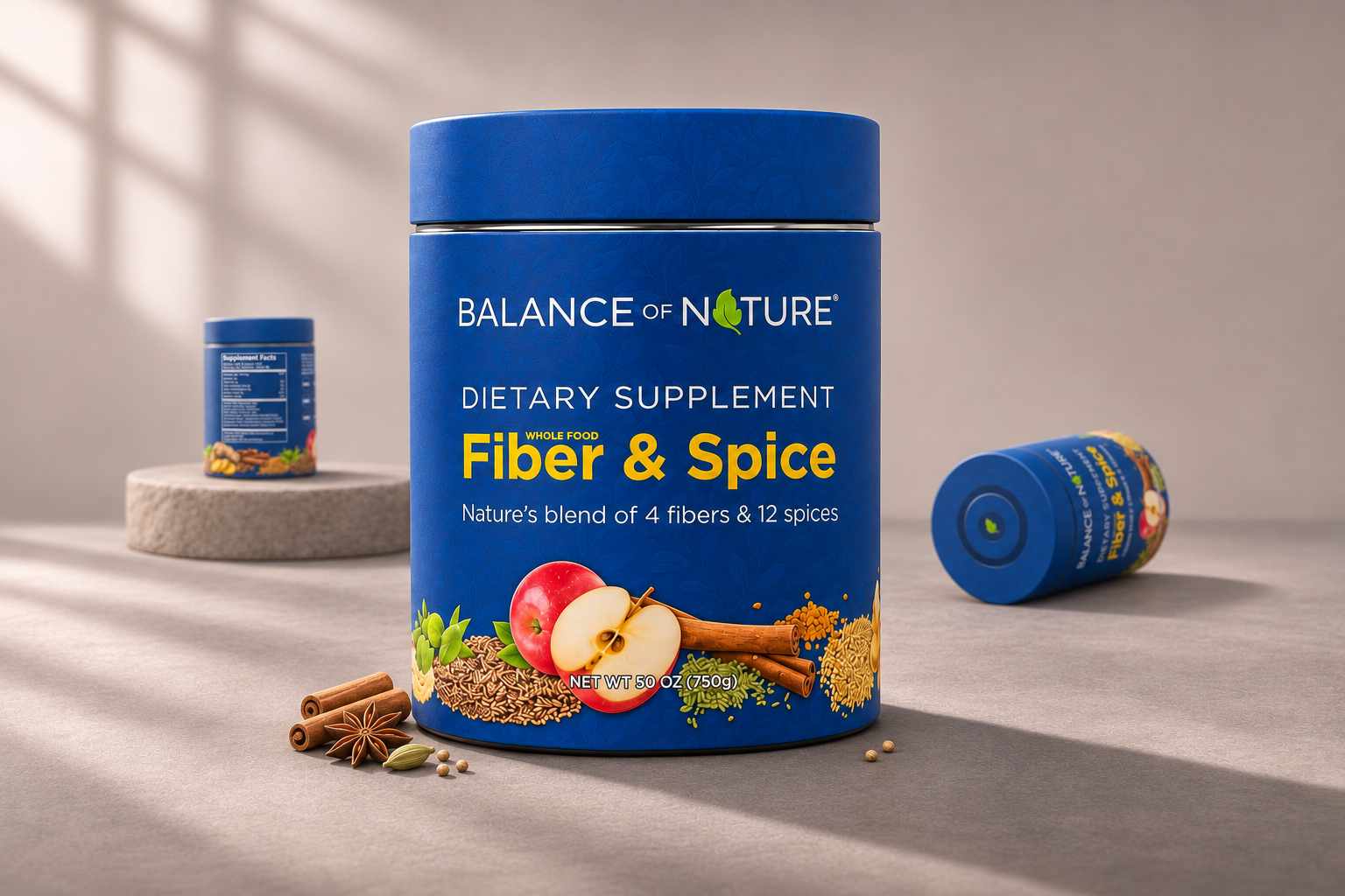
Trust, clarity & recognition.
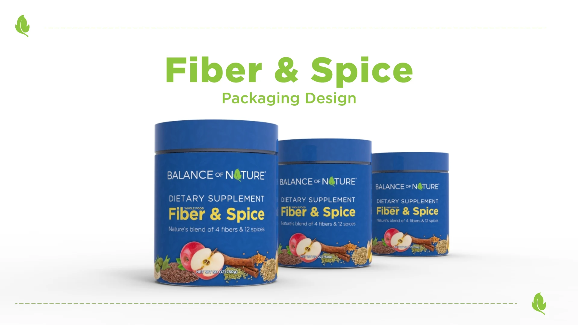
This project explores packaging design for a natural dietary supplement brand. The concept focuses on building trust and shelf visibility through clear brand hierarchy, botanical visual cues, and ingredient-focused imagery. A deep blue base paired with high-contrast typography enhances product recognition, while natural ingredient visuals communicate transparency and wellness positioning.
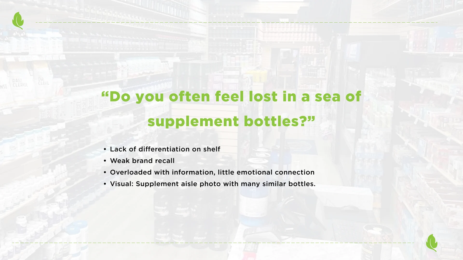
Do you often feel lost in a sea of supplement bottles?
More than ingredients.
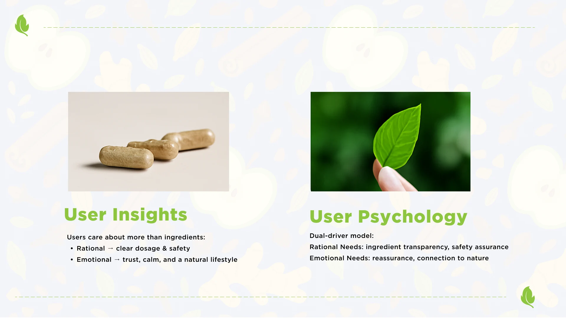
Users care about more than ingredients: Rational → clear dosage & safety. Emotional → trust, calm, and a natural lifestyle.
Dual-driver model: Rational Needs: ingredient transparency, safety assurance. Emotional Needs: reassurance, connection to nature.
A clear visual hierarchy.
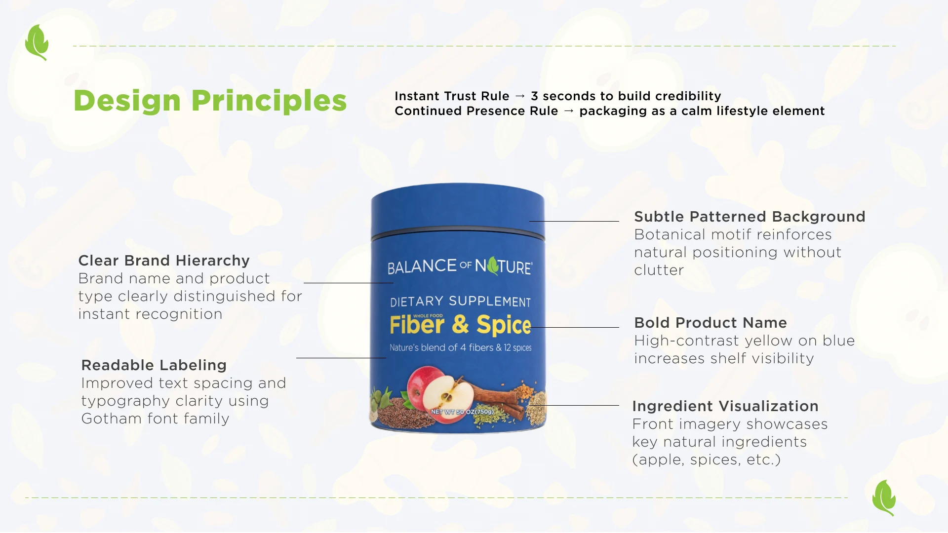
Clear Brand Hierarchy
Brand name and product type clearly distinguished for instant recognition
Bold Product Name
High-contrast yellow on blue increases shelf visibility
Readable Labeling
Improved text spacing and typography clarity using Gotham font family
Ingredient Visualization
Front imagery showcases key natural ingredients (apple, spices, etc.)
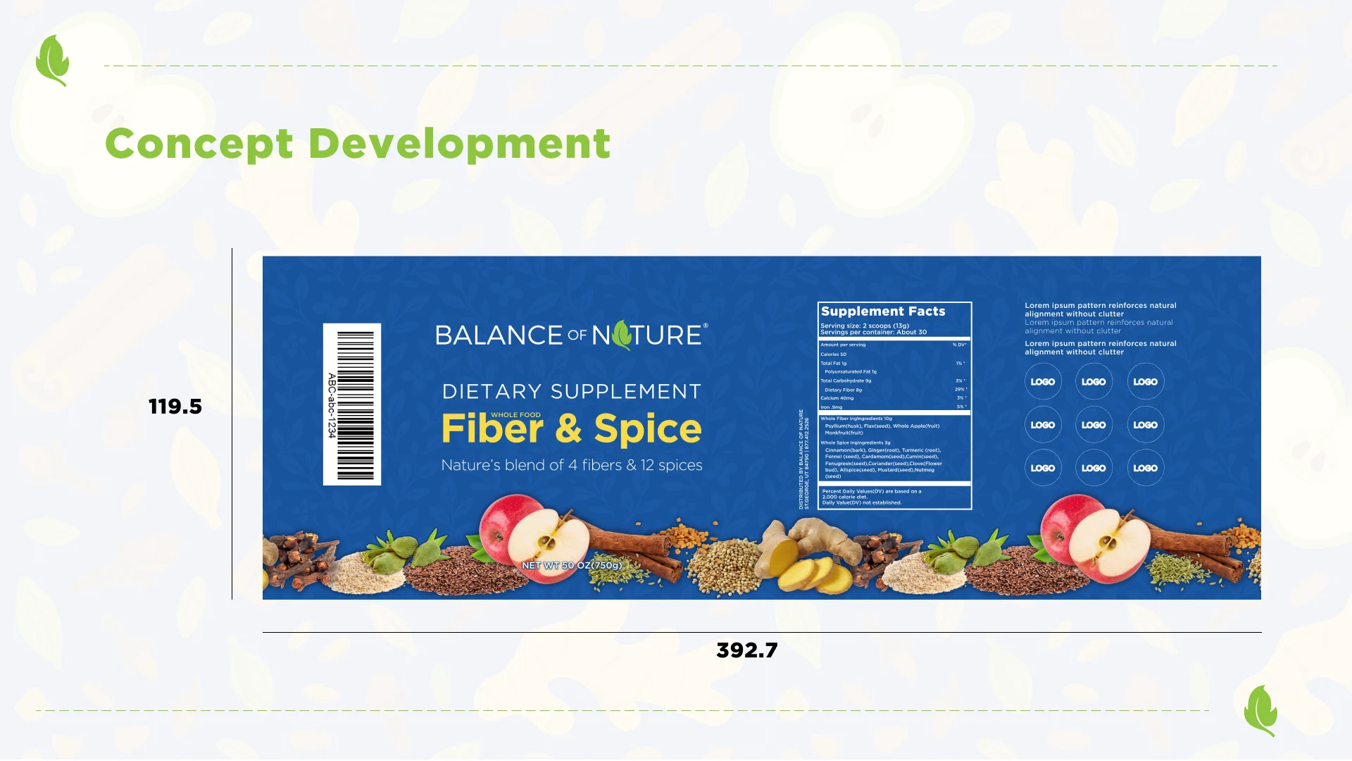
Subtle Patterned Background
Botanical motif reinforces natural positioning without clutter
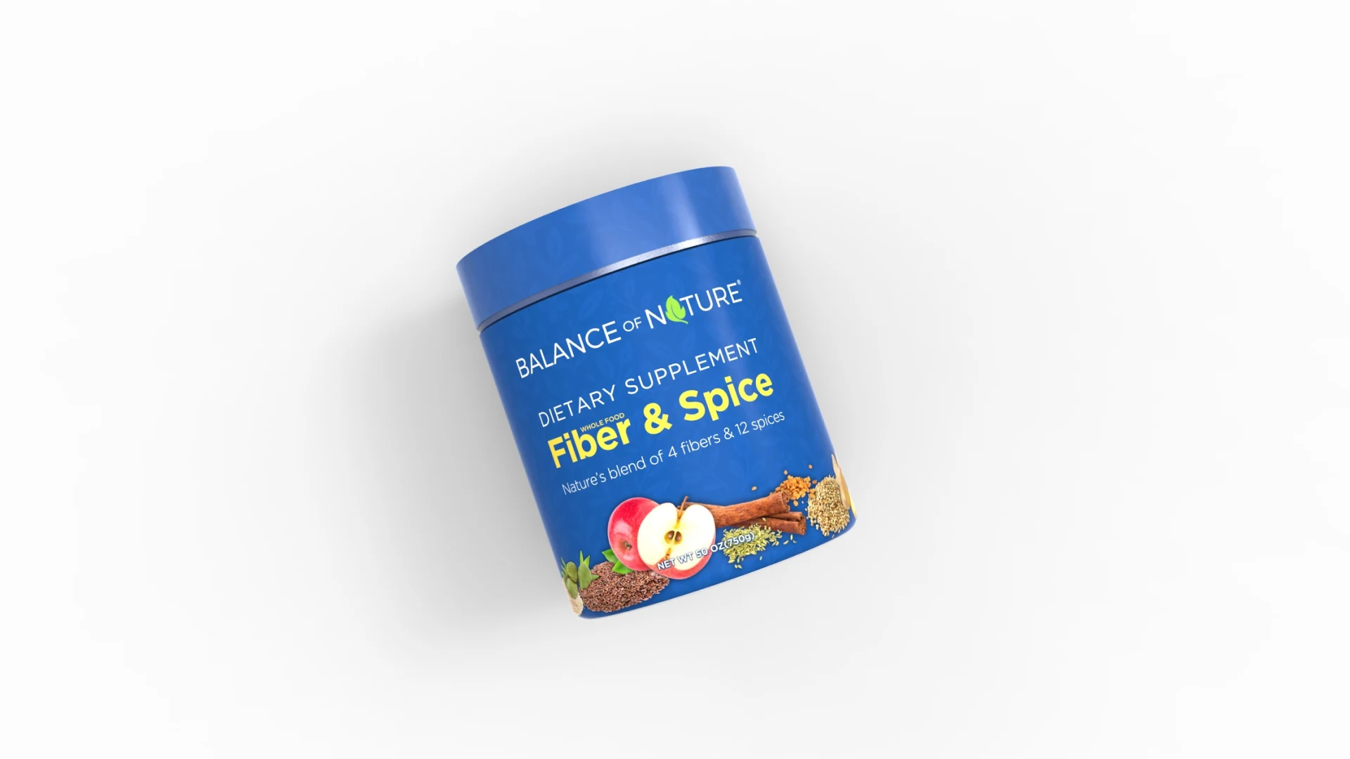
Recognition from every angle.
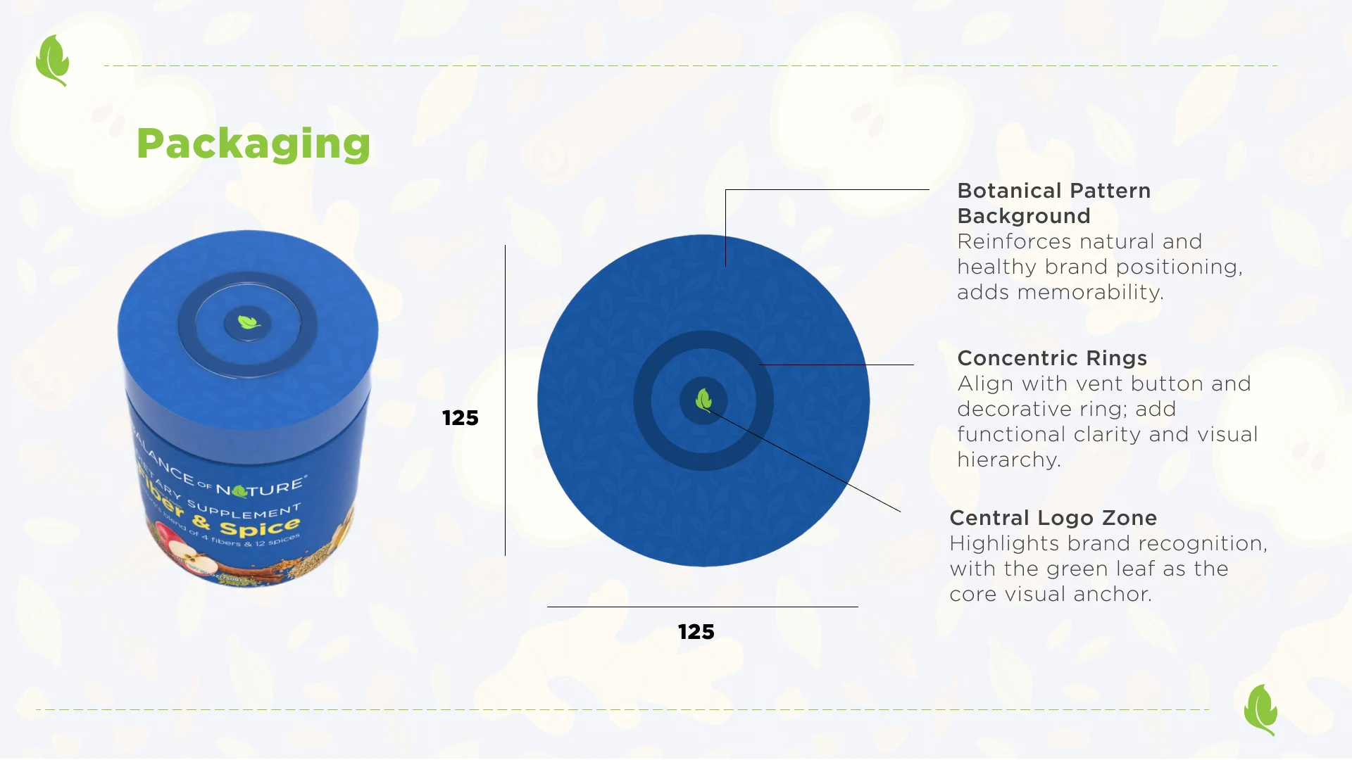
Botanical Pattern Background
Reinforces natural and healthy brand positioning, adds memorability.
Concentric Rings
Align with vent button and decorative ring; add functional clarity and visual hierarchy.
Central Logo Zone
Highlights brand recognition, with the green leaf as the core visual anchor.
Everyday balance.
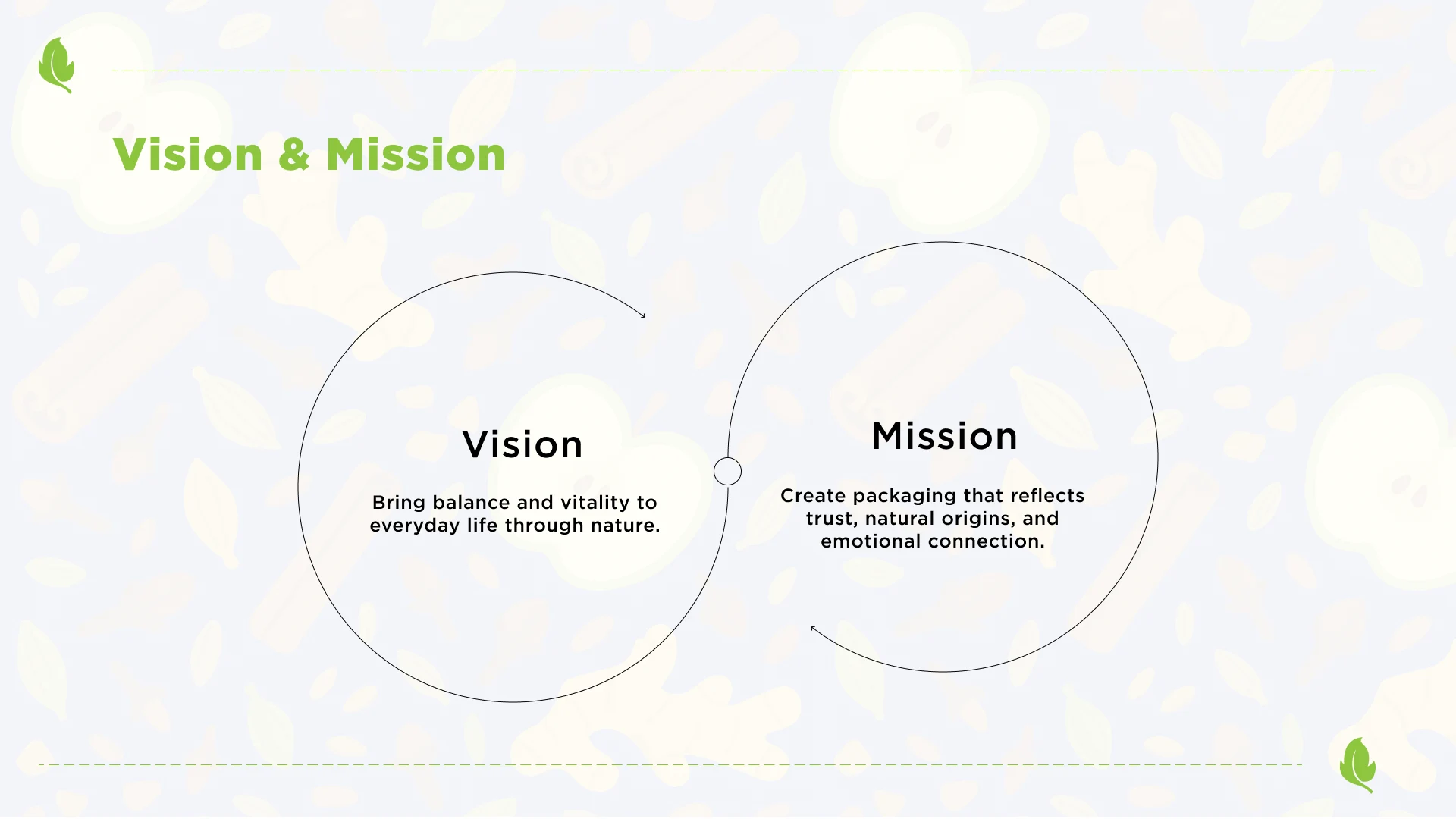
Bring balance and vitality to everyday life through nature.
Create packaging that reflects trust, natural origins, and emotional connection.
Packaging & Graphic Design
Led packaging redesign for a premium product, applying design principles, color theory, and typography to reduce production costs while maintaining brand positioning
Designed 12+ marketing and sales assets, including one-sheets, brochures, and handouts, using Adobe InDesign to support business development initiatives
Translated complex scientific and nutritional concepts into clear visual storytelling for print and digital platforms
Contributed to brand activations and campaign materials, including trade show booths and display systems
Improved cross-team efficiency by structuring approval workflows and asset organization systems
Original design development